During Attorney General Jeff Sessions‘ hearing before the House Judiciary Committee on Tuesday, Rep. Louie Gohmert (R-Texas) busted out a dizzying chart attempting to make sense of the so-called Uranium One deal.
The deal, which went through in 2010, has been a major talking point for conservatives alleging some sort of wrongdoing between Russia and then-Secretary of State Hillary Clinton. The alleged wrongdoing hinges on Clinton unilaterally approving of the sale—she didn’t—in exchange for money flowing into the Clinton Foundation. Several other government agencies had to approve the sale and offer permits as part of the deal.
They also argue that, because current Special Counsel Robert Mueller was director of the Federal Bureau of Investigation at the time of the deal, it makes him unable to lead the federal investigation into Russian interference in the 2016 election, which includes any connections the country had with President Donald Trump‘s campaign.
Even Fox News‘ Shepard Smith went through the reasons why the attempt to create a conspiracy out of the Uranium One deal doesn’t hold much weight.
Shep Smith just took apart the Uranium One conspiracy theory in what amounts to a methodical annihilation of his own network’s coverage of the story. pic.twitter.com/D439QyIBWU
— Matthew Gertz (@MattGertz) November 14, 2017
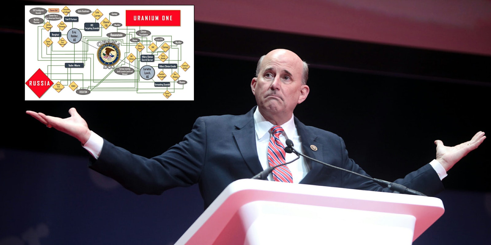
But for Gohmert, the deal apparently is worthy of scrutiny. During Sessions’ hearing he brought out a large board with several names, companies, agencies and government entities all tied together with long green lines.
Rep. Louie Gohmert briefly displayed this chart in the Sessions hearing, arguing Obama DOJ was compromised & Mueller should step aside pic.twitter.com/Qdb9Oi2gHz
— Sarah Mimms (@mimms) November 14, 2017
“We got a chart here that shows just how integral the relationship is with Mr. Rosenstein, Mr. Mueller, into this whole Uranium One thing,” Gohmert said, waiving a paper with the chart on it. “It sure stinks to high heaven and it doesn’t appear to me that they aught to be involved in investigating.”
The chart is a dizzying mess of lines, circles, squares and diamonds all with numerous names and events connected with a number of green lines. However, as the internet quickly pointed out, the chart doesn’t make much sense.
IMPORTANT UPDATE: Here, care of Rep. Louie Gohmert’s office, is the full chart he displayed at today’s House Judiciary Committee oversight hearing. pic.twitter.com/dPSHtGvwqK
— Chris “Law Dork” Geidner (@chrisgeidner) November 14, 2017
As you can see, the chart includes multiple “Obama” and “Mueller” circles, several “Obama State Department” diamonds and “Susan Rice” diamonds, and even a “Comey” diamond separate from a “Comey” circle.
The chart drew swift mockery from the Twitter peanut gallery.
https://twitter.com/GScottShand/status/930555026275291138
— Adam Smith (@asmith83) November 14, 2017
BREAKING UPDATE h/t @passantino pic.twitter.com/HzSiXffB53
— southpaw (@nycsouthpaw) November 14, 2017
https://twitter.com/poliscimystery/status/930557555037954048
https://twitter.com/FreddieCampion/status/930559917567631360
https://twitter.com/JakeLaperruque/status/930557539800047617
https://twitter.com/jbillinson/status/930531244294668288
Of course, public mockery likely won’t put an end to the Uranium One truther movement. But it does make it a whole lot more entertaining for everyone else.

