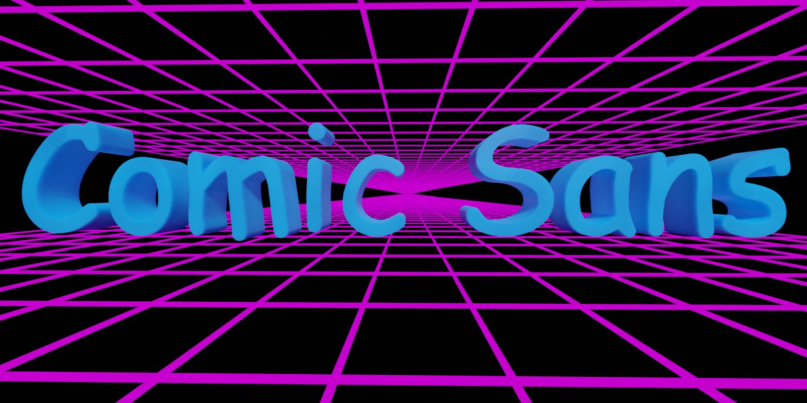
No one should be able to tell you what to write, but they can recommend you to write in Comic Sans.
The much-maligned font found a small pack of defenders on Tumblr this week, and the impassioned defense of Comic Sans has caused others to take notice.
Tumblr user @arahir started it off by posting: “Last night @phaltu discovered that setting your font to Comic Sans in Google Docs improves writing speed and creativity by an insane amount.”
The author tried it for herself and they agreed. @arahir goes onto argue that Comic Sans might be the perfect antidote for writer’s block. A few others chimed with their Comic Sans success stories across all kinds of writing.
@jenroses added that every writer should “pick out a REALLY basic font like Comic Sans…and use that to write in.”
Clearly, the defense of Comic Sans resonated, as the post had 126,000 notes as of Thursday morning.
As it turns out, this is not actually the first time Comic Sans has received a passionate defense. There is actually a long line of writers who swear by the mystical powers of the derided font.
https://twitter.com/SarahTaber_bww/status/1187760704029384705
In April, Laura Hudgins argued in The Establishment that Comic Sans is one of the best fonts for people with disabilities, thanks to its simplicity. Hudgins asserts that her sister may not have finished college without the font, thanks to its clarity and simplicity.
In 21018, Dolores Toner posted, “Yes, Really: Comic Sans is Making Me a More Productive Writer” on Medium. Also last year, a Lifehacker article titled, “Get Over Yourself and Start Using Comic Sans” came to the defense of the font.
In Lifehacker, A.A. Newton wrote (presumably in Comic Sans):
“The entire point of Comic Sans is that each letter is totally distinct from the others. It’s why people who have dyslexia love this font: the irregularly-shaped letters make it easier to break words down into their component parts and properly interpret them.”
As it turns out, this argument is backed up by the British Dyslexia Association, Dyslexia Association of Ireland, and the American Institute of Graphic Arts.
Full Disclosure: This post was written in WordPress in what appears to be a serif font of some kind. But, to each their own.
READ MORE:
- The Comic Sans comeback is the perfect expression of our cultural confusion
- Designer sobers up Comic Sans font with streamlined Comic Neue


