This Week On The Internet is a weekly column that recaps the most pressing online discourse of the week and runs on Fridays in the Daily Dot’s web_crawlr newsletter. If you want to get this column a day before we publish it, subscribe to web_crawlr, where you’ll get the daily scoop of internet culture delivered straight to your inbox.
Analysis
This month, a handful of upcoming movie posters have been criticized for their bad editing, overall design, or both.
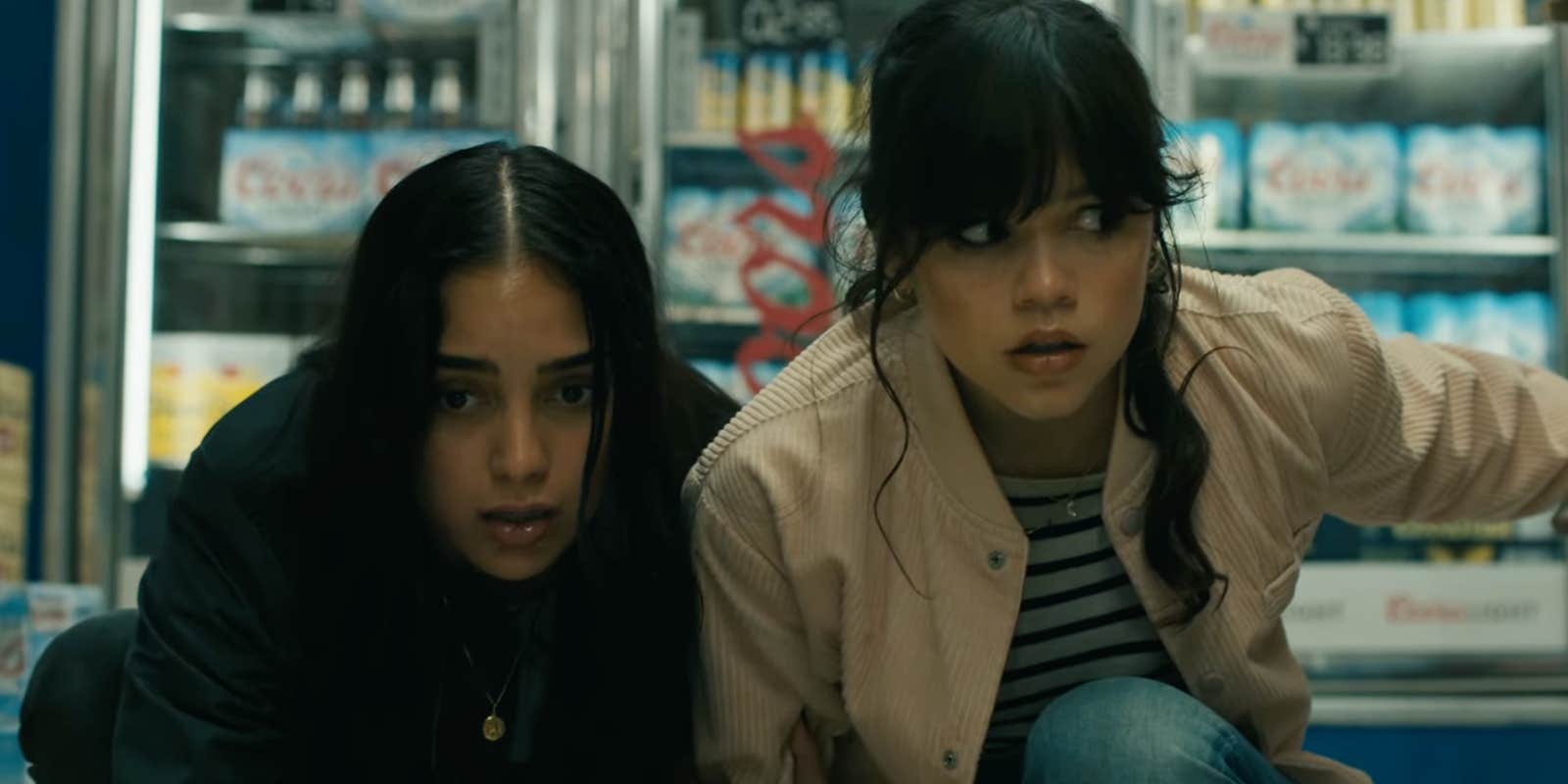
The latest example arrived on Thursday when the trailer and promotional materials for Scream VI dropped. The poster for the latest Scream movie, out in March, depicts 13 characters plus Ghostface set in front of the New York City skyline. The poster unfortunately is part of a larger trend of franchise ensemble movies that seemingly want to include every single character on the poster, even if it looks objectively bad. (For reference, the early Scream posters included all the main characters, which was usually only around five people.)
If you think this design looks familiar, that’s because it’s utilized most commonly on superhero blockbusters. Earlier this week, Gavia Baker-Whitelaw wrote about the backlash to Ant-Man 3’s poster.
While the poster only includes half the number of characters on the Scream poster, it was still dragged for its tired design: the main villain and hero in large photos, and the supporting characters in increasingly smaller photos. It doesn’t appear that a lot of thought was put into it.
Meanwhile, a poster for an upcoming re-release of an older film—Titanic—was criticized earlier in January for what appeared to be a bad Photoshop job. Kate Winslet’s hair has different textures on each side. Titanic’s 25th anniversary poster isn’t that different from the original movie poster, but the editing of Winslet’s hair in the new poster was immediately called out on social media.
Why it matters
The discourse over multiple movie posters this month shows that people still appreciate good design in a poster—and if you mess up, people will notice. Despite the frequency that films are discussed and dissected online, studios are still releasing promotional materials that look outdated or rushed.
Horror movie posters in particular have long been used to tease an element or display a frightening image, which is why the new Scream VI poster is offputting. It’s reminiscent of a Marvel poster. There are, however, more creative posters for the film that play into the location.
But the “floating heads” style poster? We’ve seen it too many times.


