Popular workplace collaboration tool Slack took the opportunity to launch a new logo on Wednesday, and the responses have been, shall we say, interesting.
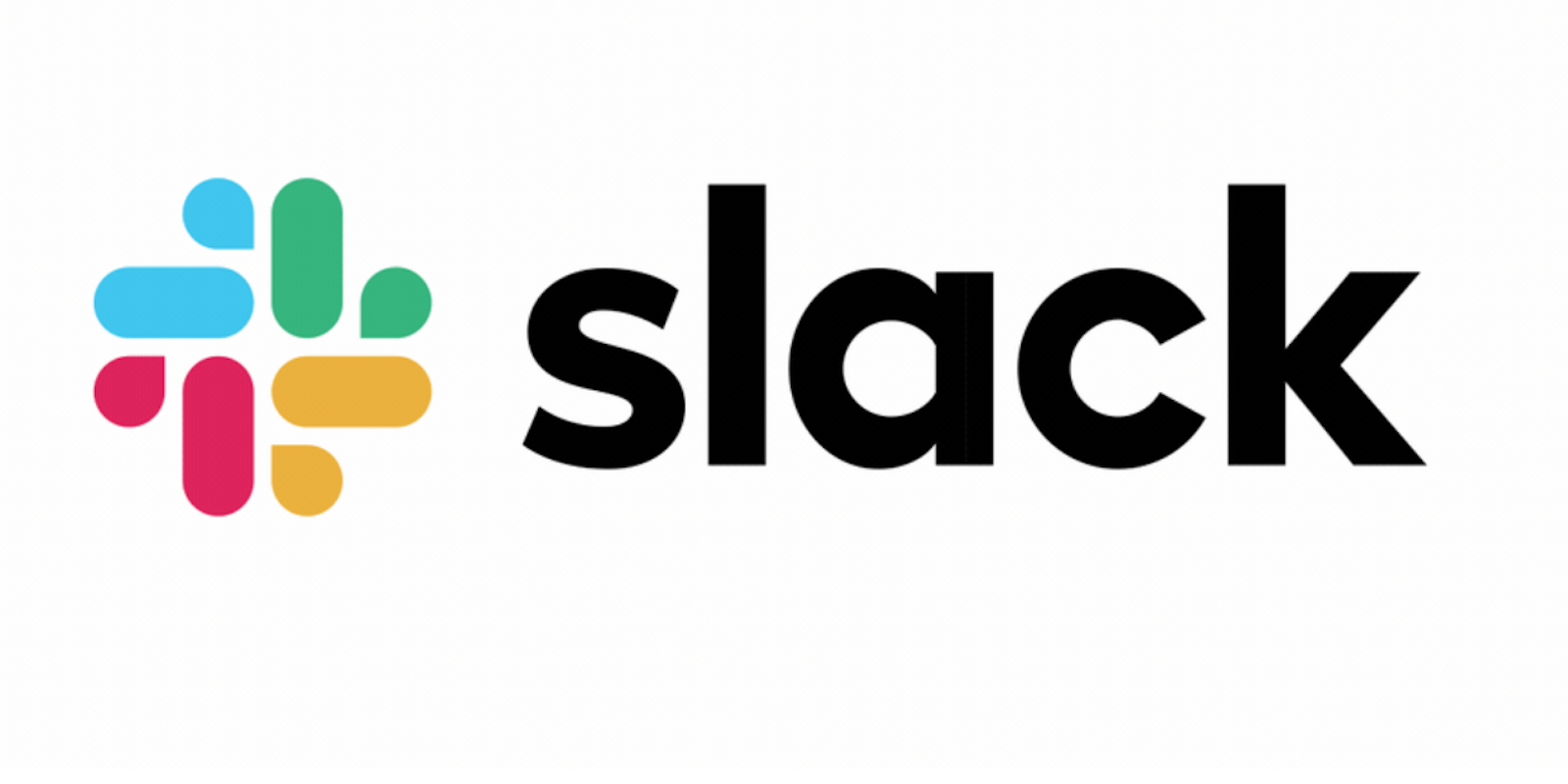
Evolving from an easily recognizable and four-toned hashtag, Slack has now undergone a somewhat messy-looking “evolution” into something more “cohesive” and recognizable, according to Slack’s official blog on the matter.
Designed by Slack’s in-house brand team as well as Michael Bierut and the Pentagram team, the new logo uses a “simpler” color palette and different shapes entirely. The company consistently ran into issues, it explained, getting its previous logo to look just right. If it wasn’t placed on a white background, it would look off, if it wasn’t tilted properly, or anything like that, it didn’t work.
“It pained us,” read the official Slack blog.
But while the app’s new logo may be more cohesive in terms of branding and advertisement, it’s not quite catching on with ardent, everyday users. Given that Slack is an integral tool for many in-house and remote office workers, it’s something people tend to notice and start talking about—and fast. Social media remains abuzz with thoughts on the new logo.
RIP Slack logo
— òwó (@actual_weeaboo) January 17, 2019
https://twitter.com/jeffreymoro/status/1085747511615201280
https://twitter.com/kstenflan/status/1085747389665705984
新しいSlackのアイコンです。 pic.twitter.com/FKag9sl437
— ZZ ZZZ(ズズ ズズズ)@アレジゴクゲームス (@arezigoku) January 17, 2019
New Slack logo looks like it’s for a public swimming pool pic.twitter.com/Jtm6NxX6Po
— Rik Lomas (@riklomas) January 16, 2019
The new Slack logo looks like its for a health insurance or pharma company. pic.twitter.com/O4PHaAQBPR
— Brett (@BrooklynBrett) January 16, 2019
New Slack logo is giving me some very church in a strip mall vibes pic.twitter.com/iR1cCUMN2m
— sarahannelloyd.bsky.social (@sarahannelloyd) January 16, 2019
As some users pointed out, there’s an unfortunate design error with the logo, as well, as the negative space can indeed form a swastika.
https://twitter.com/BadLuckKuma/status/1085613180603297793
https://twitter.com/jtth/status/1085746184059322369
https://twitter.com/alexdante/status/1085745612174155782
Not only is the logo dividing users, but it’s also gotten in the way of the app’s functionality. Previously, a Slack notification while using the tabbed version of the desktop app gave you a nice large, red dot to let you know you’d been pinged. It was easy to spot and immediately simple to see if someone had been trying to communicate with you.
The new logo’s notification dot is much smaller, and barely perceptible in the tab, meaning the overall change is, at least for some users, a step backward.
https://twitter.com/MolotovCupcake/status/1085611537132335105
Slack responded that this was something the company would “point out to the team.”
We see what you mean! Things will take time to settle, but we’ll point this out to the team.
— Slack (@SlackHQ) January 16, 2019
It looks like Slack and its legions of users will be in for some substantial growing pains as everyone adjusts to the change.
