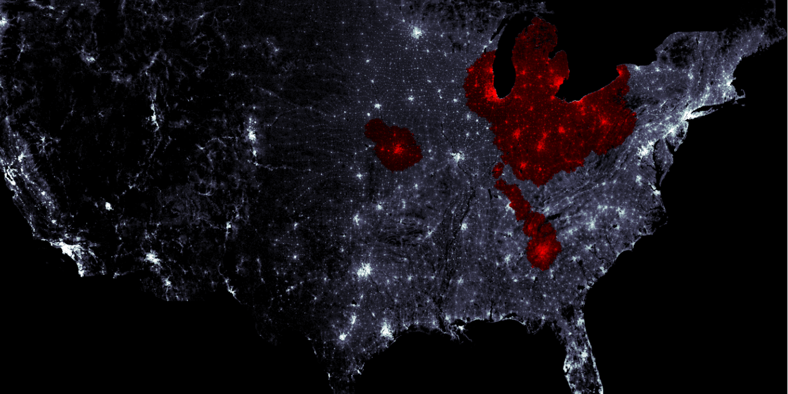
Shows like The Walking Dead are great at presenting the overall environment of a zombie apocalypse, but rarely do they convey just how fast an end-of-days contagion would move.
A pair of Cornell University grad students took it upon themselves to figure that part out, and now they’ve created an interactive map that shows you how long it would take for the shuffling undead to reach your front door.
Zombie-Town USA
Mike Wehner
Zombie-Town USA is extremely easy to use. Simply click anywhere on the map to place a single zombie and watch the mayhem unfold before your eyes. Using several adjustable parameters—including the speed at which infected people move and the likelihood that a bite from a zombie will result in immediate death—you can tweak the strain of the zombie infection and watch pattern change.
Alexander Alemi and Matthew Bierbaum, the Cornell grad students, built the map using the most recent census data, down to each individual city block, in order to present the most realistic possible scenarios. As you’d expect, the zombie plague typically slows in more rural areas and speeds up when it reaches population centers.
Alemi and Bierbaum, along with professors Christopher Myers and James Sethna, have authored a lengthy paper on the creation of the map and the complex algorithms that run it. It turns out the safest place to be during such an event is a place like Montana. Who knew?
Photo via Zombie-Town USA
