OK, kids. Today we’re going to talk about gravity. And potatoes.
Thanks to Newton, we all know that what comes up must come down. But did you know that what comes down comes down with just slightly less pressure if you’re standing in Europe or the South Pacific?
We’re used to thinking of Earth as a smooth ball in space, but in reality, of course, its topography is full of peaks and valleys. Our gravitational field is like that, too: At different points on the planet, gravitational pull is stronger or weaker than at other points.
That’s what this confusing infographic, which resurfaced on Twitter Tuesday, attempts to show us. It’s called the Potsdam Gravity Potato, because it looks like a potato and scientists are great at naming things.
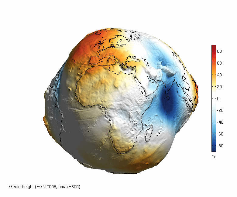
What you’re seeing above is an attempt to visualize the shape of earth’s gravitational field. The model is called a geoid—and it looks the way it does because if you took away all other factors, the variations in gravity would cause the Earth’s surface, even the oceans, to dip and cave and convex.
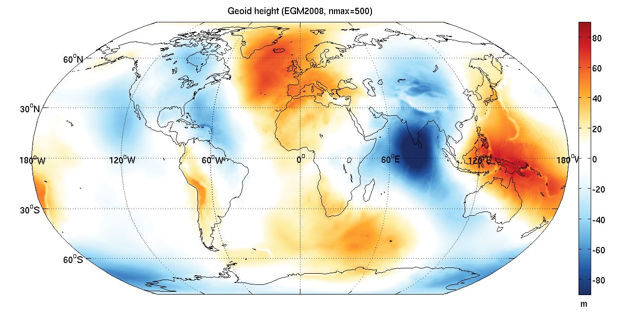
This map shows you the theoretical height of Earth as a geoid. The scientists at MATLAB, who came up with the animated infographic, tried to visualize how the earth would look if gravity affected all parts of the earth, including the oceans, without taking into account winds and tides and currents or the current surface topography.
The white areas are places where the gravitational pressure is close to the mean actual height of the earth. The red areas are places where the height of the geoid is higher because the actual gravitational field is weaker. The blue areas are places where the height is lower because the field of gravity is stronger in those areas.
As a graphical representation of the geoid, this version isn’t perfect. For one thing, in order to illustrate the differences, the impact of the gravitational field has been exaggerated significantly. Here’s a 2-D map, also by MATLAB:
You might not think this kind of hypothetical exercise would be important, but it’s actually been crucial to the development of GPS technology and other cartographical marvels. Over the years, science has gotten its calculations of what the geoid would look like down to an art. This particular model dates from 2011.
But you don’t need to worry that you’re in danger of floating away the next time you visit New Zealand. The actual variation in gravity over the earth’s surface is only about 0.7% from place to place across the globe.
H/T Mary Sue | Photo via NASA