When Jay-Z announced plans to transfer the NBA’s New Jersey Nets to Brooklyn, basically everyone thought everything about the new team would be a slam dunk.
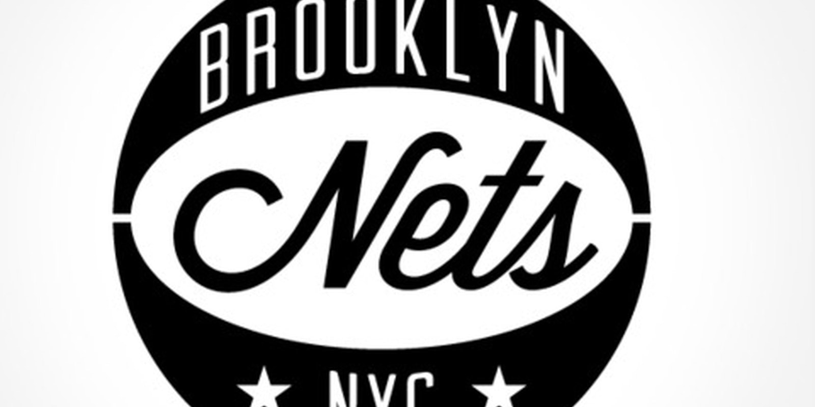
Then we saw the dull new logo. Uninspired and a drab black-and-white, it looks like Jay-Z took about five minutes to make the thing in Photoshop. Critics lambasted the new look, fans scoffed, and an influential design blog called it “technically worthless and embarrassing.”
That isn’t the blueprint Jay-Z had in mind.
So, what if the Nets could redo the logo? That’s the idea behind a new Tumblr appropriately titled Reset the Nets created by designer Andrew Guirguis. According to Guirguis, the Nets rebranding ought to have been a “graphic designer’s wet dream,” as it combined the talents of Jay-Z with iconic Brooklyn influences.
“But what should’ve been the next great fusion of franchise and fashion is a big fat fail,” Guirguis wrote, adding the logo seems “unfinished” and “half-baked.” So, Guirguis put a bit more thought into the design than Jay-Z. Since he started in early May, Guirguis has created about two dozen different logos.
All of Guirguis’s Hipster Branding-inspired creations stick to the black-and-white motif but are much more creative and innovative than Jay-Z’s take. Our favorite is the logo with the stylized-B on top of a shield-like shape—a nod to the Net’s old logo when they used to be New Jersey’s embarrassment.
We compiled some of Guirguis’s creations below.
Photo via Tumblr
