If you were among the millions of Americans nervously watching the polls roll in on election night last November, odds are you were taken aback by the disparities between the projected and actual results—results that are now clearer than ever.
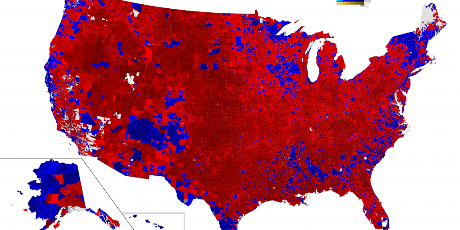
On Thursday, one election expert at Decision Desk HQ unveiled perhaps the most detailed, county-specific interactive election results map ever produced.
After spending a year making phone calls and information requests to individual voter precincts across the U.S., Decision Desk HQ expert Ryne Rohla used precinct-level data to create the map, resulting in a highly granular infographic that shows the subtle shifts across the country that resulted in President Donald Trump‘s election.
Because precinct data changes so frequently due to redistricting efforts, Rohla’s project took a great deal of individual dedication. What’s more, precincts are much smaller than ZIP codes, and have shakier boundaries. In the United States, there are just 43,000 ZIP codes in the United States compared to almost 175,000 total voter precincts, over four times fewer.
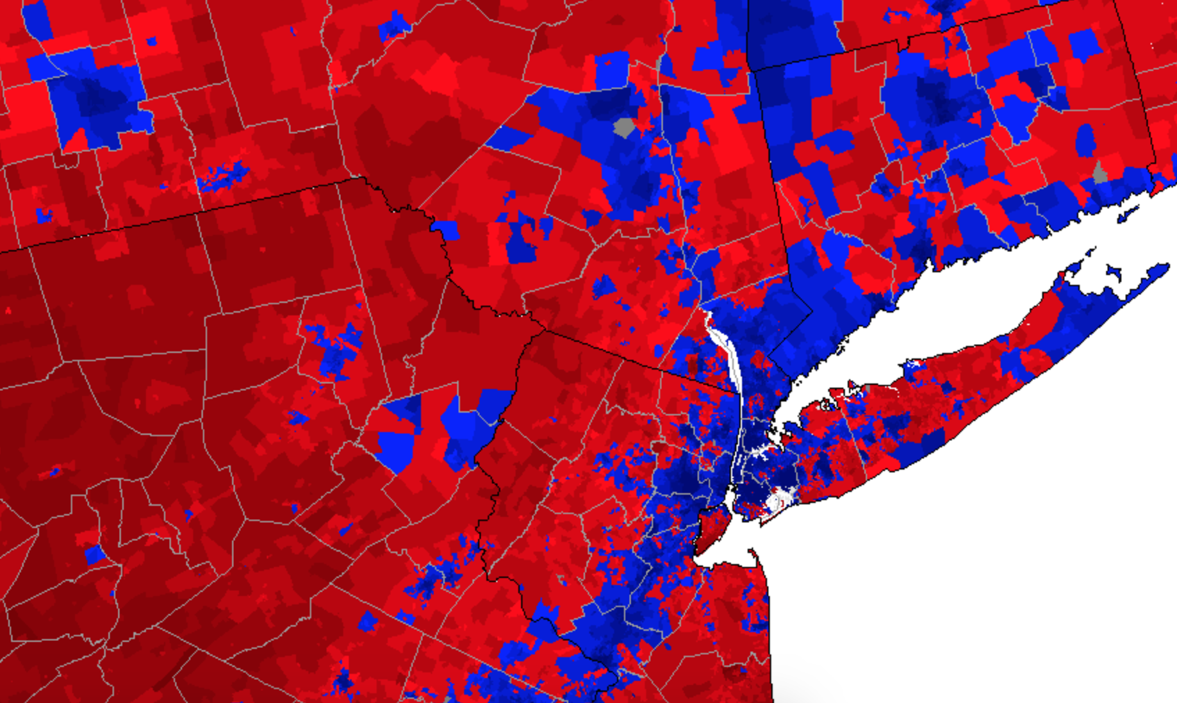
Still, the end results are accurate. The final map contains voter data from every 2016 precinct except for three extremely rural counties. That’s including more than 131 million ballots cast, accounting for 95 percent of all presidential votes in the election, Rohla explained in a post detailing his process.
“Election results tell us who we are while other statistics only hint at what we are,” Rohla writes. “Maps visually organize this information in a way both informative and artful. Using precinct-level data, I could almost walk the streets of neighborhoods and communities thousands of miles away. They made me feel connected to and in solidarity with a world I have never experienced; they remind me that I too am a part of the American democratic experiment.”
Rohla was also able to map out the results of the 2008 election for comparison and create an additional interactive “swing map” detailing which precincts indicated a true swing in election results.
This map is currently the most detailed available. It can’t give you individual voter data—that would be a violation of privacy and the democratic process—but precinct-specific comes pretty close to perfect.
So, you’ve been wondering exactly how that annoying upstairs neighbor voted in the 2016 election, you probably just have to ask. Or not.
