
If design hadn’t triumphed by 2012, it had by 2013.
Three years after launching the iPad, Apple was the world’s most valuable company, and even second-order pundits knew why: design. Steve Jobs’ remark that design was “how it works” had achieved what seemed like widespread comprehension, and recruiting wars for top designers rivaled those for top engineers. Salaries escalated, but cachet escalated faster; entire funds emerged whose only purpose was to invest in designer founders, and with money and esteem came the fetishization of design, the reduction of designers into archetypes, the establishment of trade cliques and the ever-increasing popularity of trend-ecosystems.
There were valedictory encomia about the power of design to deliver better products and therefore better commercial outcomes for companies and better utilitarian outcomes for users. In his rather more sober but nevertheless remarkable talk at Build 2013, David Cole noted that thanks to Apple:
Taking a design-centric approach to product development is becoming the default, I’m sure it will be taught in business schools soon enough…This is a trend I’ve observed happening across our whole industry: design creeping into the tops of organizations, into the beginnings of processes. We’re almost to the point, or maybe we’re already there, that these are boring, obvious observations to be making. Designers, at last, have their seat at the table.
For those of us who believe in the power of design thinking to solve human problems, and to a lesser extent in the power of markets to reward solutions when the interests of consumers and businesses are correctly aligned, this was invigorating news. Parts of the technology industry spent much of the 1990s and even the 2000s misunderstanding what design was and how it could help improve products. There was a time, after all, when Apple was a laughingstock. Now, in part thanks to Jobs and the entire culture of the company, as well as its undeniable financial success, designers would be heard and could make bigger contributions to human progress.
It’s now 2014, and I doubt seriously whether I’m alone in feeling a sense of anxiety about how “design” is using its seat at the table. From the failure of “design-oriented” Path and the recent news that Square is seeking a buyer to the fact that Medium is paying people to use it, there’s evidence that the luminaries of our community have been unable to use design to achieve market success. More troubling, much of the work for which we express the most enthusiasm seems superficial, narrow in its conception of design, shallow in its ambitions, or just ineffective.
To take stock, let’s consider three apps that ought to concern anyone who hoped that the rising profile of design would produce better products, better businesses, better outcomes.
1) Dropbox’s Carousel
Dropbox isn’t an obvious candidate for a design-obsessed company, but under the direction of former Facebook designer Soleio, it has nevertheless become one, stockpiling designers at an impressive rate with a relatively simple pitch: We have the world’s data, its photos, its documents, its digital lives, as a massive foundation. Build great products on top of that.
One can see how this might seem plausible enough, and indeed Soleio has assembled a strong team. In the design community, anticipation for the fruits of their labor has been widespread, and Carousel seems to be the first indication of what they’ll be up to.
Carousel is an app for storing and sharing photos. Dryly described, it almost seems like it was released several years late by accident; after all, many solutions already address both needs. Carousel has nice touches—it attempts, with middling success, to enlarge the “most interesting” photo on a given view when it lays out your pictures, and it uses some possibly handy but easily forgotten gestures—but its main standout at launch was some gratuitously sentimental and derivative marketing.
It’s honestly hard to determine what should be interesting about it, even in theory; it takes mostly standard approaches to organization, display, and sharing, and seems to do little to distinguish itself from the default iOS Photos app + iCloud Photo Sharing, let alone apps and services like Instagram, VSCO Cam, Snapchat, iMessage, Facebook Messenger, and so on.
Its value seems to be unclear to iPhone owners, in any event:
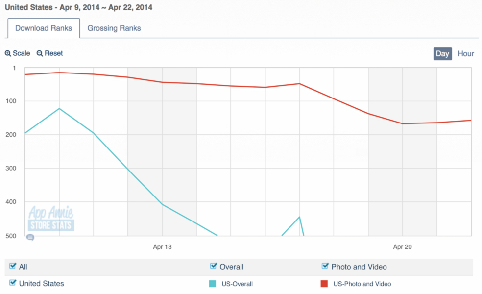
If Carousel is intended to solve a user problem, neither I nor other potential users seem to be able to figure out what it is. It seems likelier to solve a Dropbox problem: how to get consumers to pay for higher tiers of Dropbox services by getting them to store all of their photos there. But Flickr, too, will store all of my photos, with additional functionality and without a fee. And Apple will also store many of my photos, and with iCloud Photo Sharing will let me share them in the manner Carousel does.
Despite an immense amount of press at its launch, Carousel is faring poorly in the App Store. Perhaps there are plans for the future development of more useful, differentiating features, but until then, it’s duplicative of existing and adopted solutions and seems to offer no incentive for switching from whatever one uses currently.
If you gathered some of the world’s best designers and gave them significant organizational support and all the resources they need, is an app which at best matches the functionality of bundled OS features from a few years ago what you’d expect?
It should go without saying that Carousel could be on its way to becoming a great product; it should also be acknowledged that absent intimate familiarity with its development, we can’t be confident who’s to fault for its paltry functionality and underwhelming differentiation. Perhaps it was rushed, poorly executed, or the fault of some errant executive. But that hardly accords with what one knows about Soleio, and in any event, the team seems happy with it.
But who is helped by this app? Whose life is improved? Whose problems are solved? What is now possible that wasn’t before? What is even merely easier?
2) Facebook’s Paper
Facebook has landed some of the best designers in the industry over the past several years, often acquiring their companies outright in order to do so; folks like Wilson Miner, Nicholas Felton, Mike Matas, and many more have gone over to the new Big Blue. While Felton was reputed to be responsible for a Timeline redesign, Paper is known to be the work of Matas, along with several other folks in Facebook’s “Creative Labs” group.
Apart from its performance in the marketplace or success with users, Paper is interesting for two reasons:
1) The continuing physicalization of the UI, which Matas helped along by designing iPhone OS 1.0 while at Apple, is important for making computers usable. A significant percentage of our progress in computational accessibility comes from the utilization of increased power or device awareness to deliver more persuasively “realistic” physical models for UI elements. First, the GUI; then additional colors, layering, and transition animations; now, velocity physics, the making of manipulable “objects” out of app elements, and so on. The better we get at this, the easier computers are to use and the more power we devolve to users, enabling their aspirations.
2) Facebook spent lots of time and effort on creating a design/development environment to make UI elements like those in Paper easier to implement. They also open-sourced some of their work, helping others to physicalize their UIs, too. Given that Apple seems uninterested in this at the moment—focusing more on data, services, interconnection, and the like while iOS remains mostly a series of scrolling views with headers and footers?—?Facebook’s leadership is useful.
That said, Paper is not actually a good product in itself, and users don’t seem to be keen on replacing the main Facebook app—which is quite awkward in its animations, webby in its janky scrolling—with it:
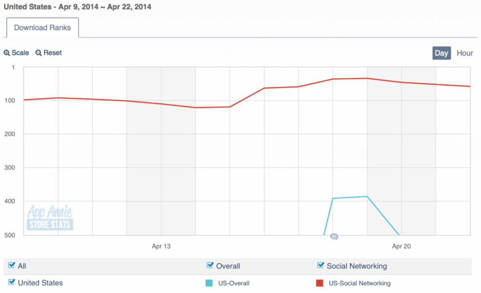
While this is better than Carousel, it’s still beneath apps like Keek, We Heart It, Kik Kak, and even Google+. If rumors of poor in-app metrics like engagement are true, the download numbers are just the start of the problem. What Paper seems to be is a lovelier UI for Facebook. Path spent tens of millions of dollars attempting to achieve the same goal; both teams seem determined to ignore that for most users, the problems with Facebook do not actually have to do with how pretty it is.
To the extent that Paper is an initial step of UI renovation with substantial functional goals—for example, perhaps the “cards” of user stories have the ultimate aim of making it easier for neophytes to express what they don’t want to read or see by, say, flicking the card down—some of these criticisms are baseless. However, some of the people who made Paper suggest that in fact users are the ones who need to improve:
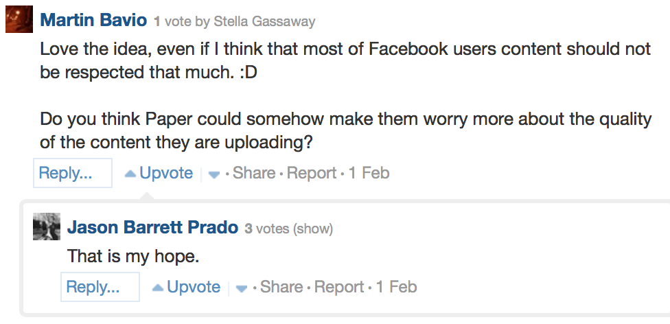
Photo via Quora
Hoping that users “worry more” about the quality of their photos seems like the wrong attitude to have. It’s worth noting that everyone I know who’s happiest with Facebook uploads whatever they want, including ugly, low-resolution photos, garbage meme-images, random, hyper-compressed videos, and the rest of the junk that they find interesting. It all looks insane in Paper. Wanting users to spring for DSLRs and learn how to shoot their kale salad with a shallow depth of field so that the very lovely new app you’ve built isn’t ruined by their tastelessness is exactly backwards.
Using Paper, I have a sense of anxiety: What if this is what designers make when not yoked to “product thinking?” What if Matas et alia sans Jobs or Forstall are capable of impossibly perfect physics in UIs, of great elements of design, but not of holistic product thinking, of real product integrity? What if design uses its seat at the table to draw pretty things, but otherwise not pay much attention to the outcomes, the user behaviors, the things enabled?
Because Paper, after all, not only adds little to Facebook per se, but is in fact feature-limited relative to the main app. And this is to say nothing of the strange information architecture in it, the issues with information density, and so on. What were they really solving for? Whose lives will be bettered by it? What has been enabled?
3) Jelly
Jelly is Biz Stone’s empathy-boosting app. Or it’s an app you use to get answers to questions. The marketing makes it hard to understand:
The idea for Jelly is a complete reimagining of how we get answers to queries based on a more human approach. Jelly is a mobile application that uses photos, interactive maps, location, and most importantly, people to deliver answers to queries. On a fundamental level, Jelly helps people.
The idea is a reimagining? It is a reimagining of how we get answers based on a more human approach? More human than what? Than Google Search, which is made by humans to respond to your human inputs by connecting you to resources made by other humans? More human than Quora, which functions similarly?
From Tech Crunch:
Using Jelly to help people is much more important than using Jelly to search for help. If we’re successful, then we’re going to introduce into the daily muscle memory of smartphone users, everyone, that there’s this idea that there’s other people that need their help right now. Let’s make the world a more empathetic place by teaching that there’s other people around them that need help.
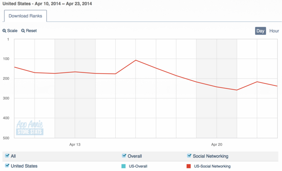
Stone seems everywhere to hedge his bets about Jelly’s real purpose, and it’s not hard to understand why: a sufficiently vague target is harder to miss. On the other hand, using the app oneself is a depressing experience; my experience with it, despite being in precisely the demographic that is likeliest to use it heavily, bears out this writer’s opinion: it is a desert. That’s probably because no one is downloading it:
To be clear: I do not believe that Jelly is purely a marketing failure. Its design is not good, despite being the startup of a fully pedigreed “thought-leader” in the industry, who says in interviews that “we designed a better way to ask a question.”
But when Google Search designed a better way to ask a question, the proof was in the answers. With Jelly, the answers are rare, slow-in-coming, often jokes, gags, or irrelevant comments, and have nothing like the crowd-vetted quality of sites like Quora. Jelly, by design, is a step backwards, re-emphasizing the quality of your own existing networks as though the very problem to be solved for isn’t the contingent availability of knowledge itself, distributed inefficiently and unequally through social connections.
From Business Week:
What Jelly does is it uses photos, locations, maps, and most importantly, people from all your social networks meshed together into one big network. It goes out not just one degree but two degrees of separation. Your query is going to real people. And they either know the answer or they can forward it to someone in their social network. This is where the strength of weak ties comes in… You and your friends generally know the same sort of stuff. But then you’ve got that one acquaintance, that lawyer, say, who brings a whole new circle of expertise. So the queries jump into these new arenas, and within a minute you get back answers from people. You see how you’re connected to that person. A real answer from a real person.
Hopefully you’re connected to lawyers, or to folks who know some. Otherwise, this “better way to ask a question” yields the same divisions society already has: someone people know the right folks to get the right answers, and others don’t. It’s not hard to see why one particularly acerbic pundit called it “Yahoo Answers for the bourgeoisie,” just as Medium is a CMS for the bourgeoisie.
While Stone’s questions about M&A law and where to get the absolute best handmade bike probably get responses, for most of us, Google, Quora, Wikipedia, and dozens of other sources besides are better places to get questions answered.
Again one wonders: what were they designing for? What outcomes did they hope to catalyze through the software and service? Whose life will be improved—or even affected? How seriously are they even taking this?
Designer, Heal Thyself
It’s not fashionable to rain criticism on creative and entrepreneurial efforts in Silicon Valley, and I apologize to anyone rankled, vexed, or hurt by these remarks. I also acknowledge again that, from outside of an enterprise, one’s analyses can be quite mistaken, and if I’ve maligned any apps or companies due to errant assumptions, I regret it. And as it happens: I use and enjoy Paper.
But for the design community, the issue is larger than anyone’s feelings, or even the success or failure of these apps. I worry about the reckoning to come when Square sells to Apple for less than its investors had hoped, or when Medium shuts down or gets acquired (or pivots to provide something other than an attractive, New Yorker-themed CMS for writers, the poorest people in the first world). While Biz Stone will walk away from Jelly smiling about yet another “valuable failure” and Soleio and Matas will always have their bodies of work, ordinary designers will be asked to please gather their things and leave the conference room in which CTOs and VPs of Sales and CEOs who remember how useless all of Square’s attention to detail turned out to be will resume making decisions. Design has, after all, passed out of vogue before.
In order to avoid losing its place atop organizations, design must deliver results. Designers must also accept that if they don’t, they’re not actually designing well; in technology, at least, the subjective artistry of design is mirrored by the objective finality of use data. A “great” design which produces bad outcomes—low engagement, little utility, few downloads, indifference on the part of the target market—should be regarded as a failure.
And if our best designers, ensconced in their labs with world-class teams, cannot reliably produce successful products, we should admit to ourselves that perhaps so-called “design science” remains much less developed than computer science, and that we’d do well to stay humble despite our rising stature. Design’s new prominence means that design’s failures have ever-greater visibility. Having the integrity and introspective accuracy to distinguish what one likes from what is good, useful, meaningful is vital; we do not work for ourselves but for our users. What do they want? What do they need? From what will they benefit? While answering these questions, we should hew to data, be intuitive about our users and their needs, and subject our designs to significant criticism and use before validating them.
Combining epistemological humility, psychological perceptivity, and technological-systematic thinking remains the best defense against launching duds, but necessary too is some depth of character, some intelligence about purposes, some humane empathy for those we serve. Because if what we design is shown by the markets not to have been useful, it’s no one’s fault but ours. And we shouldn’t think that others in organizations won’t take notice.
This post originally appeared at Medium and was reposted with permission.
Photo via vancouverfilmschool/Flickr (CC BY 2.0)