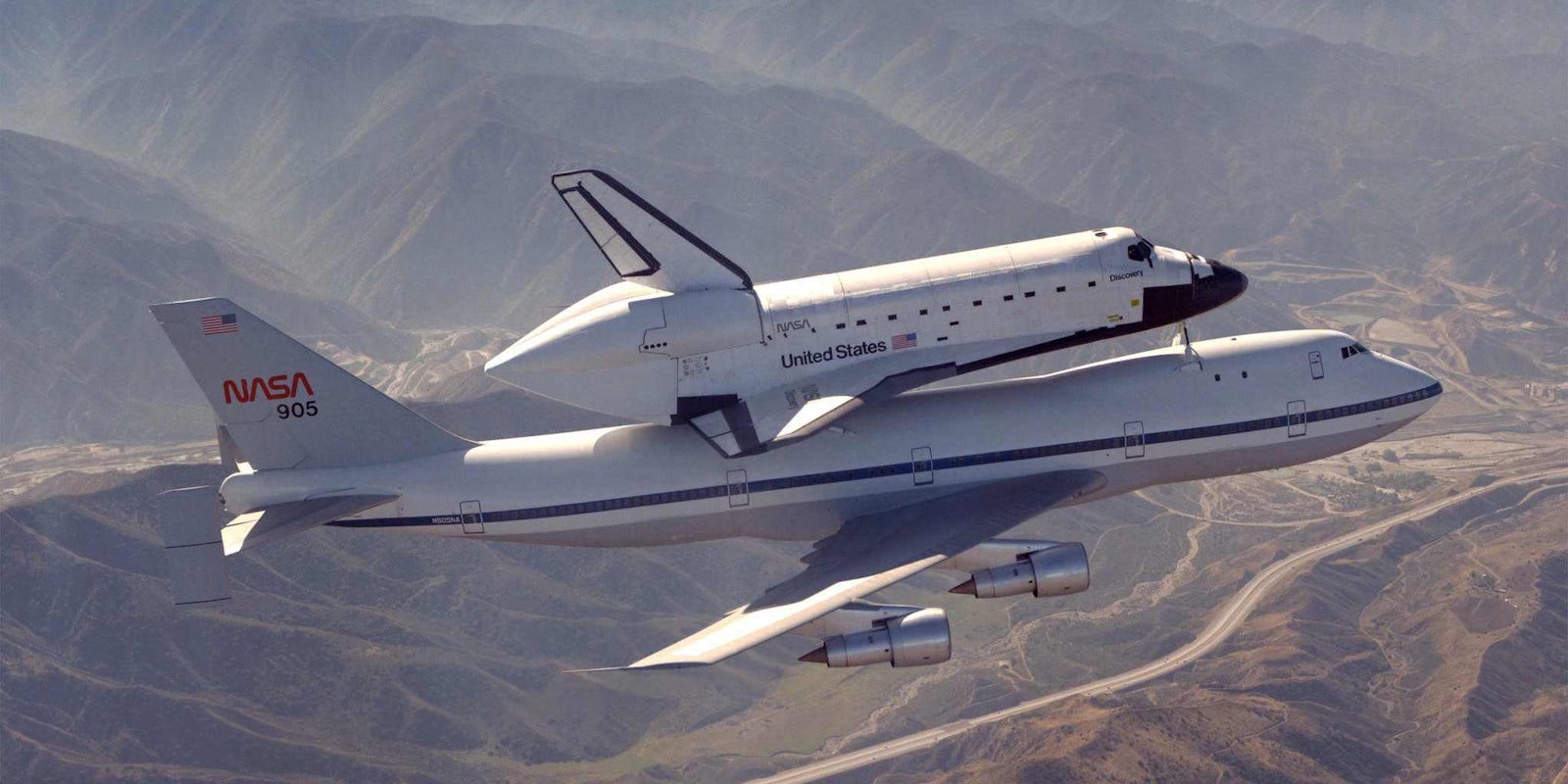
In between iterations of NASA‘s current “meatball” logo design—with “NASA” written over a starfield backdrop with an abstraction of a rocket flying above—the space agency’s logo was much different.
Older space fans may remember that the iconic symbol adorning many a craft and suit from the 1970s through the early 1990s was NASA’s “worm” logo, a simple string of rounded, worm-like letters stripped of any unnecessary features—including the dashes in the As.
Now, two graphic designers are collaborating with one of the original worm logo designers to re-release NASA’s 1975 graphical-standards manual on Kickstarter as the ultimate coffee-table book for design and space nerds alike—and they’ve already surpassed their $158,000 goal.
The manual contains all of the NASA graphics, colors, and designs from that era. Artists Richard Danne and Bruce Blackburn and their small design firm helped create the look of everything from NASA’s letterheads to its space shuttles.
People who pledge at least $79 will receive a copy of the book by March 2016. It will contain all of the original designs, plus extras created by Danne himself.
Photo via NASA (PD)


