Five years ago, Ivan Gayton would spend months at a time in the African bush with no connection to the outside world except for a satellite phone or a high-frequency radio.
But today, the head of Doctors Without Borders in Nigeria spends 75 percent of his time on a computer or a cell phone, even when working in rural Africa. And while the sense of adventure may be diminished, Gayton says the new technologies have had an “astonishing” effect on his organization’s effectiveness.
As cell phone and Internet service continue to catch up with the developed world, Gayton is already looking ahead to the next big technological advancement he thinks will change the field of humanitarianism: mapping.
“The area between sub-Saharan Africa and the Sahara desert is really prone to cyclical illnesses like cholera and meningitis,” Gayton told the Daily Dot. “We don’t know where it’s going to pop up, and how big it’s going to be. You can’t have a whole team of doctors sitting there doing nothing.”
To help alleviate this problem, aid workers turn to Geographic Information System (GIS) software. By collecting outbreak data and visualizing it on a map, Doctors Without Borders hopes to track where and how the diseases are spreading, and then devote its resources accordingly.
“If you’ve got ways to visualize your epidemiology data spatially, it can help you figure out, ‘oh that seems to be along this river,’ or ‘that seems to be consistently in this size of town.’ Those kinds of observations are very hard to make from tables of data, but they’re actually quite easy to make from maps.”
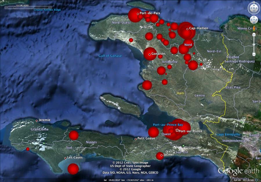
In addition to professional mapping programs like ArcGIS, aid workers have been using Google Earth. Representatives from Google even visited Gayton’s team to help train them on how to use mapping tools. It’s experiences like this that revealed to Gayton the common ground shared by the tech specter and the humanitarian world.
“Our cultures are similar in a certain way. Obviously, we’re doing radically different things, but there’s a certain, dare I say it, nerd culture that likes interesting problems. There’s something about the hacker culture that really likes an interesting problem to sink their teeth into and that’s analogous in some ways to the humanitarian culture.”
Gayton said these tools will continue to be invaluable as climate change, food crises, and political instability around the globe are poised to shake up longstanding notions about how diseases spread.
But the maps serve another equally important purpose: convincing governments, agencies, and the general public to confront the realities of infectious diseases.
“When you can show, even post-facto, the correlation between water outages, bad sanitation, or the closure of health centers with spikes in diseases, it becomes much easier to advocate to governments or other agencies to intervene. There is a long and painful history throughout the world of diseases being dealt with or not being dealt with for political reasons; people not wanting to admit that there are cholera epidemics because it makes your country look bad or it might affect tourism or trade; people not wanting to admit to things like HIV because there are cultural reasons for them to deny that it exists.
The more it becomes easy for medical and scientific people to visualize and exchange data, the more likely that the ability of governments and agencies to cover shit up is just going to evaporate. And that could be a world-changer.”
- SXSW Panel: Adapting New Technologies for Humanitarian Aid
- Sunday, March 11, 3:30pm
- Austin Convention Center, Room 6AB
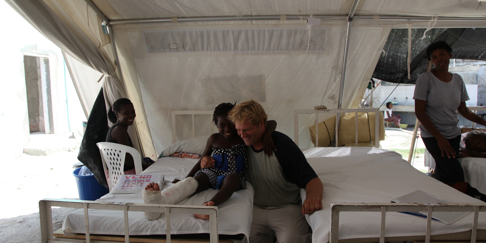
Photo courtesy of Ivan Gayton