With the release of iOS 9, Apple finally abandoned one of the most beloved typefaces, Helvetica Neue, and fully adopting one of its own creations.
A “neo-grotesque sans-serif typeface” created by a team at Apple in 2014, the San Francisco type family was initially created for the Apple Watch. The watch, with its tiny screen, required the utmost readability, and San Francisco was designed to deliver just that. But it wasn’t just good at being small; San Francisco, which Fast Company’s John Brownlee called Apple’s “most important typeface in 20 years,” boasted the kind of appealing, attractive, and easy-to-read letterforms that would work even on huge Retina screens.
The larger adoption of the font as a default for phones, tablets, and other devices earlier this month went largely unnoticed by most users, who may have just barely raised an eyebrow at the fairly subtle change. But for a small population, the update represented a huge improvement; for the one in five individuals with dyslexia or another language-based reading limitation, San Francisco is a sight for sore eyes.

San Francisco is perhaps not perfect (typographer Tal Leming told Wired that he didn’t love some of the numbers), but its dynamic capabilities and the fact that it was actively designed for digital display make it a more elegant and effective typeface for the modern era. That also makes it a more effective typeface for people who have a hard time reading, especially from screens.
For the one in five individuals with dyslexia or another language-based reading limitation, San Francisco is a sight for sore eyes.
The challenge of reading with dyslexia has become much more public in the last several years. Numerous crowdfunded awareness-boosting campaigns have been launched by designers hoping to graphically represent their struggle, and there have been a number of typefaces designed especially for individuals with dyslexia, which can be downloaded for personal use.
Unfortunately, these typefaces—especially Open Dyslexic, which was touted mostly for existing but not as much for working—have been found to perform fairly poorly (many dyslexics find them clunky and, beyond that, unattractive) and tend to be so specialized in appearance that wide adoption of them is highly unlikely.
Still, there is a real need for typography that is actually accessible to the upwards of 20 percent of people who have a hard time making out the letters on their screens. And unfortunately, many of the typefaces most adored by designers are the very ones which haunt those who struggle with reading.
Designer Christian Boer, who created Dyslexie, one of the more widely used and attractive dyslexia-specific typefaces, explained the issue to Dezeen magazine in 2014:
“When they're reading, people with dyslexia often unconsciously switch, rotate and mirror letters in their minds...Traditional typefaces make this worse, because they base some letter designs on others, inadvertently creating 'twin letters' for people with dyslexia.”
Consider Helvetica, which is widely regarded as one of the most utilitarian, attractive typefaces (though not by everyone; Gizmodo once called it “anemic”). Its “u” is just an upside-down “n,” and “b” is simply a rotated “d.” Helvetica’s “r” and “n” are so standardized that, too close together, they can easily appear like an “m” (as in the word “modern”). Its tittles (the dots above an “i” or “j”) are more like dashes than true circles, which can make them appear precariously close to their uppercase selves.
It is, as designer Daniel Britton pointed out, excruciatingly difficult for those with dyslexia to make sense of.
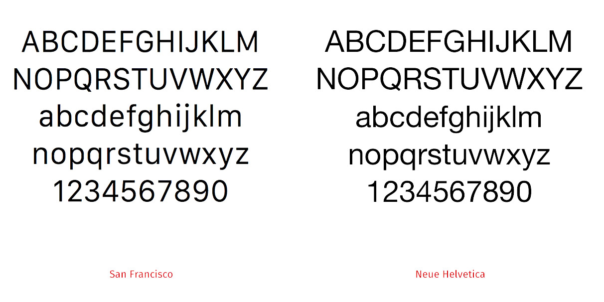
San Francisco addresses many of these concerns, making it a generally more readable typeface for both dyslexics and non-dyslexics alike.
Whereas the sides of the letters in Helvetica are flat, San Francisco presents rounded edges, allowing for more space between letters. The tittles are true circles; the crossbars rest comfortably away from the rest of the letter. And then there’s perhaps one of the most important changes, which is the x-height (the height of the lowercase letterforms), which is taller and more spacious.
“One of the keys to readability is what is described as the large x-height: lower-case letters are around 75% of the height of capitals, making lower-case letters larger than in a typical font,” wrote Ben Lovejoy at 9to5Mac. “The ‘eye’ of letters like e and a – the gap between the tail and the rest of the letter – are also larger than usual.”
These subtle shifts make it easier for the reader’s brain to quickly differential letterforms, and they help reduce the trouble of twin letters or other shifting or blurring that dyslexics often encounter.
But what’s perhaps the most important about San Francisco is that it does something that specialized, dyslexia-focused typefaces have not yet done: It improves readability while also upholding traditional design standards. At WWDC, type designer Antonio Cavedoni, who worked on the team that created San Francisco, called the typeface “both inconspicuous and beautiful”—which is a significant shift.
Previous attempts to make life easier for dyslexic readers have been mostly functional and not particularly concerned about aesthetics. The precedent that this set is that people with disabilities may have something that’s beautiful or something that works well, but never both.
Though designers love to quote Steve Ballmer’s assertion that “accessible design is good design,” often, the particular shades of accessibility and disability aren’t necessarily considered when creating the technology that we use every day. This is, like so many other matters of inclusion, in part a reflection of the homogenous nature of Silicon Valley—where tech companies are pressured to be more inclusive in their hiring practices but typically only do so when they can directly connect it to their bottom lines In Silicon Valley in 2014, just about 17 percent of individuals with a disability who wanted to work were employed.
“If it is designed by people who aren’t aware of the special needs of people who are blind or mobility-impaired, there is a danger that it won’t be designed with every possible user in mind,” explained Larry Goldberg, Yahoo’s director for accessible media.
Here, Apple is leading the access charge; the Accessibility App catalogue is inspired by the anniversary of the passage of the Americans with Disabilities Act, and the iPad has been a game-changer for people with disabilities, making communication, education, and even therapy easier and more fluid.
With San Francisco, Apple has demonstrated that good design is also good business and good corporate responsibility.
Photo via Woodley Wonderworks/Flickr (CC BY SA 2.0) | Remix by Jason Reed


#/media/File:San_Francisco_Display_SP.svg)