Peering judgmentally through their thick-rimmed glasses, hipsters have an unique way of seeing the world and a new Tumblr now envisions how they see logos, in particular.
In “Hipster Branding,” the grayscale Tumblr reimagines corporate logos through the eyes of the creative types. “Holding up a mirror to artsy community,” is how the blog describes its (probably not for profit) mission.
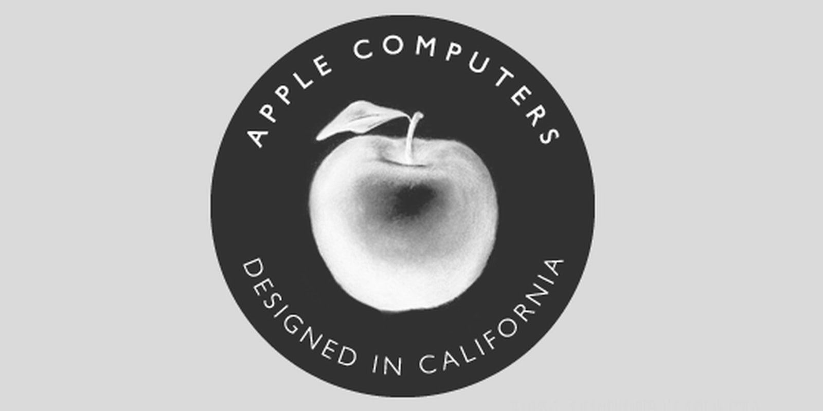
Logos reworked include financial giant Goldman Sachs, which looks like American Apparel’s creative team has taken over; while the Apple logo is redesigned with a juicy apple from the neighborhood food coop and a new slogan: “Designed in California.” Take that, Foxconn!
Our favorite, however, is the new Kentucky Fried Chicken logo. It’s adorned with big, black Warby Parker-like glasses and a hip mustache that makes it look like Colonel Sanders has been spending too much time at Brooklyn Flea.
Ikea, Adobe and NASA also get the hipster treatment but dig through it quickly before anyone else finds out about it.
Photo via Hipster Branding


