Twitter’s now such a big deal it’s not even Twitter. It’s just a logo.
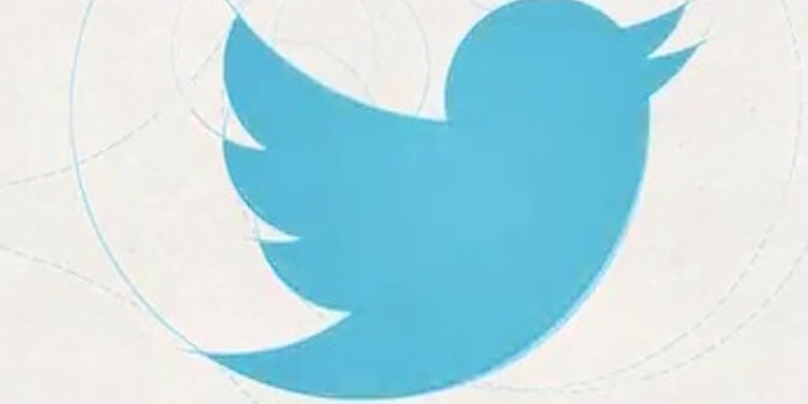
The company’s new icon consists of a much simpler bird design and will stand by itself as the symbol of Twitter. In other words, the word “Twitter” has been dropped from the branding. No text appears on the logo, not even the lowercase “t” the company was using for a while.
As creative director Doug Bowman explained in a blog post, the logo stems from Twitter’s love of birds, simple design, and working within design constraints.
The concept of your interests, ideas, and networks interacting with each other is represented by the three sets of overlapping circles that comprise the logo. A flying bird also represents freedom and possibility, Twitter said.
What’s particularly interesting about this is that Twitter is now so ubiquitous, and Larry the Bird so recognizable, that the company thinks ordinary people will see the logo and instantly make the connection to the company. While Twitter’s peers like Google and Facebook predominantly use lettering in their logos, the community is now shooting for Apple-esque iconography in its branding.
Photo via YouTube
