They say time is money, but nowhere is that more true than during the music arm of the annual South by Southwest conference in Austin, Texas.
As more than 2,000 acts scramble for the eyes and ears of the festival’s 30,000-plus attendees, downtown Austin becomes a writhing mass of music where new names and old faces converge. No matter where you stumble, there’s going to be music, but there’s zero guarantee that what you’ll hear will be good. How’s a tastemaker to choose?
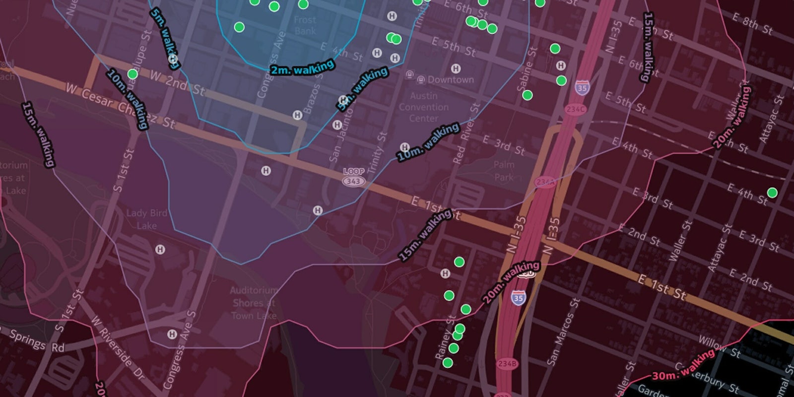
Some leave it all to chance, while others put algorithms in charge of helping them find the next big thing. But now there’s a more curated option in between: The folks at CartoDB have released an interactive map that lets you see where all the shows are happening and how much of a pain it’ll be to get there. To help you decide if the gig is worth the surge pricing, they’ve added Spotify integration so you can preview the band, too. Simply click on a venue—represented by a green dot—and filter by day to see who’s on the bill. The map automatically recenters on that venue so you can plot out your next move too.
Any seasoned SX veteran will tell you, though, that the best-laid plans can go out the window in an instant, so don’t get too attached to your minute-by-minute schedule.
Screengrab via nerik/Github
