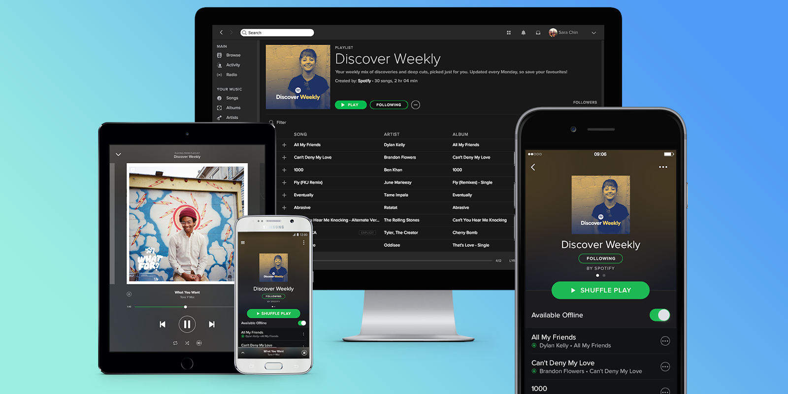
Spotify has a major event coming up next week, but it seems that we’re getting a peek at some of what the streaming music app has in store ahead of those April 24 announcements. Namely, some users of Spotify’s free tier of service are seeing a redesigned user interface in the app. The new look reportedly makes free listeners’ experience more similar to those of paying subscribers.
The new interface, which includes a couple of interesting features, was first spotted by the Verge. Perhaps most notably, it adds the ability for non-paying users to listen to select playlists on-demand rather than purely in shuffle mode. Playlists that can only be played in shuffle mode are designated with a blue shuffle icon to the left of their name.
Spotify is also changing up the way songs display on your phone’s screen when playing. Now, fullscreen album art is the de facto imagery when you’re playing a song. Before, fullscreen art was only used for select playlists. Spotify also made changes to its bottom-screen navigation menu. It removed the Browse button from this section, instead folding that functionality into the Search section. It also removed the Radio button (and seems to have removed that capability altogether).
The redesigned app also prominently features a Premium button in the lower navigation menu—making it easier for those dabbling with Spotify to upgrade to the full thing if they choose.
On April 24 Spotify will be hosting its first event since the company went public. There, we should get a complete rundown of what’s new with Spotify, and any updates on its free and premium mobile apps. As this batch of updates hasn’t been confirmed by Spotify, it’s unclear whether this new look will roll out next week or at a later date, but we’ll find out soon enough.
H/T the Verge


