


Since its inception in the 1970s, the Star Wars logo has become a pop culture icon, harkening back to that classic struggle between good and evil that’s made the series a household name. Nearly half a century later, Star Wars’ logo has gone through some changes. But overall, that same look originally introduced in the 1970s remains.
There’s a lengthy and fascinating history behind the Star Wars logo, dating back to those early days when George Lucas was still working on the film that would become known as A New Hope. Over a half dozen movies later, the franchise has taken a completely different turn from those years with just Luke Skywalker, Han Solo, and Princess Leia. Here are some interesting facts about the Star Wars logo’s history over the years.
8 fascinating facts about the Star Wars logo
1. The early Star Wars logo was radically different
As Gizmodo points out, the original Star Wars logo was a triangular decal. According to artist Ralph McQuarrie, this version depicted an early male character design (McQuarrie points to Han Solo or Luke Skywalker) with a prototype lightsaber. Not unlike Lucas’ previous film American Graffiti, this early production decal was used on film canisters and internal equipment. The film’s original title, The Star Wars, appears in a Futura Display-esque font. It was a very different look for the movie, to say the least.

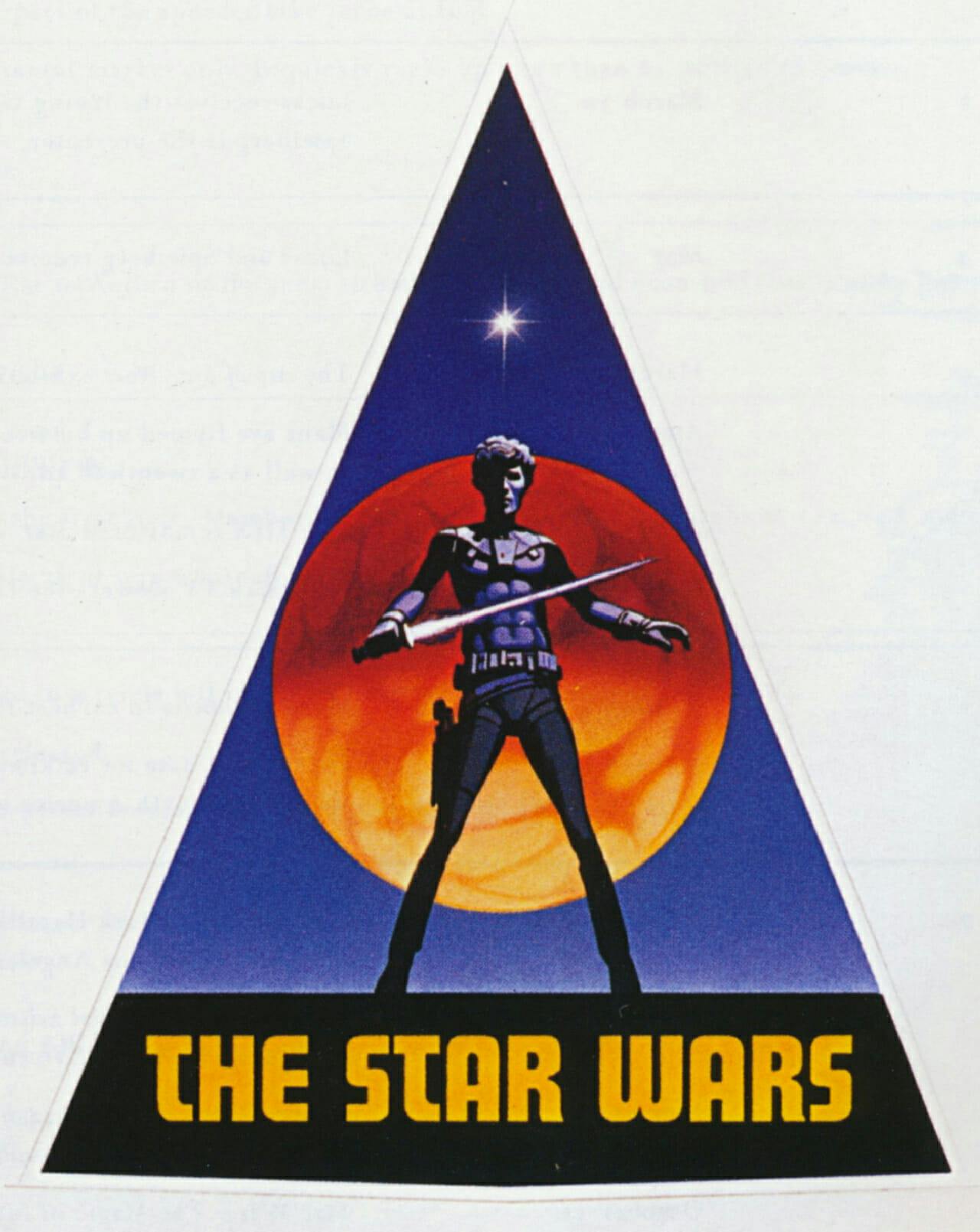
Things changed rather quickly as the film’s release loomed. By late 1975, 20th Century Fox cut the “The,” giving Star Wars its iconic name. Once the title changed, Lucas and his team decided to rework the logo’s entire look. But the pre-production sticker gives fans an insight into Lucas’ early vision for the series before shooting began.
2. Some prominent designers worked on the Star Wars logo
During A New Hope’s various logo designs, several famous designers hopped on board to help create different renditions for the movie.
For instance, designer Dan Perri created one logo that used a vanishing point. This version featured prominently on ads and posters for the film before release, and it was created with the movie’s iconic opening crawl in mind (which Perri also developed). Perri also worked on Raging Bull, Close Encounters of the Third Kind, and Taxi Driver.
Joe Johnston revised Suzy Rice’s logo and created the final look we now know today. He later worked with Steven Spielberg on Raiders of the Lost Ark, and directed Honey, I Shrunk the Kids back in the late ’80s. So yes, there actually is a link between Honey, I Shrunk the Kids, Raiders of the Lost Ark, and the original Star Wars, interestingly enough.

There’s also the logo designers who worked on Star Wars’ adaptations. When Marvel Comics created a comic version of the original film, Stan Lee brought on Jim Novak to convert the logo into a comic book format. Novak went on to work as a letterer for Avengers, Doctor Strange, and Fantastic Four during the ’80s, just to name a few, continuing to influence Marvel’s most popular titles and logos.
READ MORE:
- Everything we know about ‘Star Wars: The Last Jedi’
- ‘Star Wars’: The complete movie calendar
- 9 things you didn’t know about the Millennium Falcon
3. George Lucas wanted the Rice logo to look ‘very fascist’
Star Wars‘ logo isn’t necessarily fascist in nature. But when A New Hope was in production, Lucas wanted the film to leave potential moviegoers with a lasting impression—and he chose a particularly controversial way to do so.
While creating the series’ new logo, Lucas turned to Suzy Rice and asked her to create a design that looked “very fascist.” She chose Helvetica Black. The reason? She alleges a book she read the night before the logo’s due date claimed Helvetica had roots to Joseph Goebbels’ official Nazi propaganda typeface.

According to Gizmodo, this is only partially true. The Nazis favored san serif and Gothic fonts, but Helvetica Black’s legacy stems far from the Nazi regime itself. The two just appear to come from similar font families, even though Helvetica emerged independently with no connection to Nazi Germany.
Still, Nazism certainly influenced the logo, even if Rice’s reasoning was slightly off.
4. Uniformity came in later years
When A New Hope was originally released as Star Wars back in the 1970s, several different logos were floating around advertising the film. And that means a huge portion of ads and merchandise didn’t use Rice and Johnston’s iconic look to promote Star Wars.

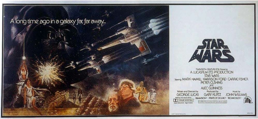
A 1976 novelization ghostwritten by Alan Dean Foster used Helvetica font, bypassing the film’s logos altogether. Posters promoting the film before release used Dan Perri’s rejected logo with the words “Star Wars” stretched out, as if the logo was warping out to the distance. And even after Rice’s official logo was revised by Johnston, some merchandising products would still use Rice’s lettering, while others would take on Johnston’s.
It would take until the 1980s for Johnston’s take on Rice’s logo to finally stick, and by the ’90s, almost all Star Wars merchandise relied on it one way or another. Until then, various designs and redesigns emerged, defining those early years as slightly disconnected compared to the uniformity we saw later.
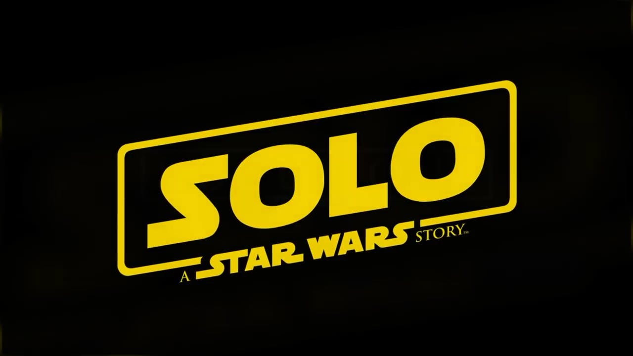
5. Solo: A Star Wars Story and other modern logos have historic roots
Han Solo’s 2018 spin-off film Solo: A Star Wars Story uses a frame around the main title to represent its connection to the Star Wars universe. It was a clever and new idea at the time. But as it turns out, there’s actually a long history of Star Wars titles using a frame, dating all the way back to the first sequel.
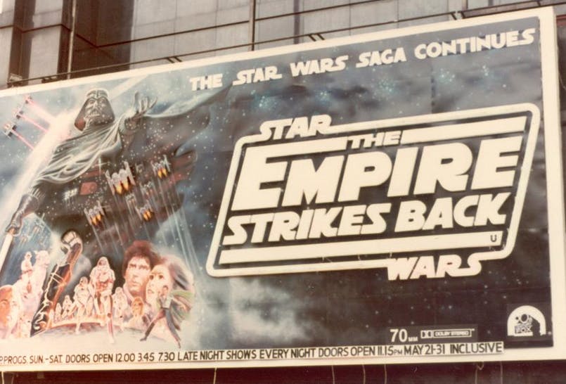
When The Empire Strikes Back began its marketing run for its 1980 release, ads for the film turned the Star Wars logo into a frame, placing the episode’s subtitle in the middle. This was a major first for the Star Wars logo, starting a longer legacy for handling the movies’ subtitles. The series’ approach to episodes would change over the years.


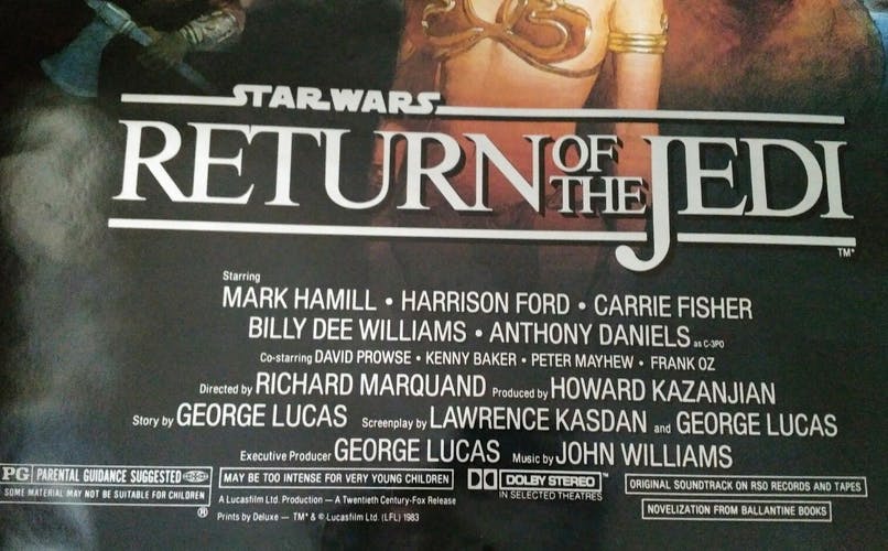
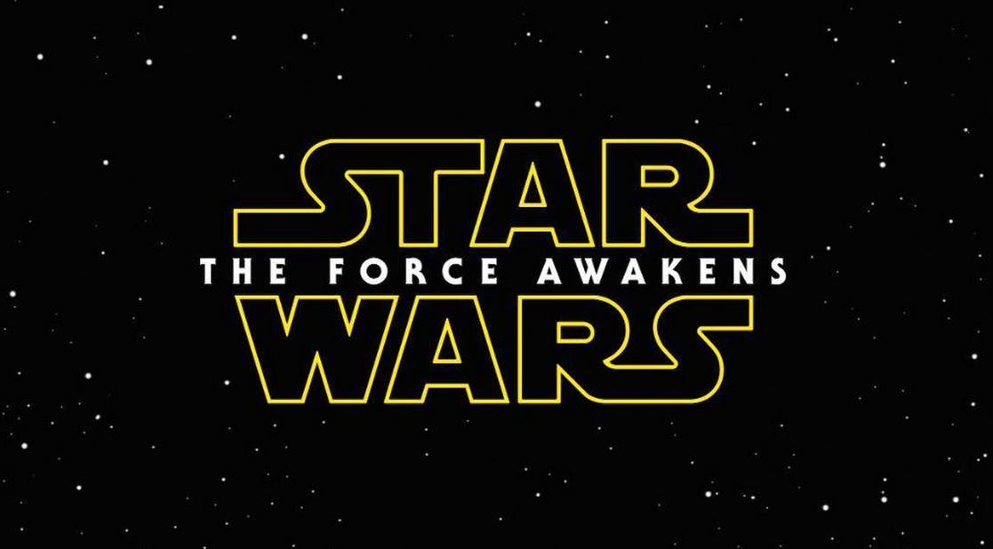
Return of the Jedi put its title underneath “Star Wars” and gave the film an open border horizontally. That change would eventually continue with The Phantom Menace, leading to episode titles being placed between the words “Star” and “Wars” without any border included. This is the case with Disney’s The Force Awakens and The Last Jedi, which place their episode titles in between both words.


But the closed border frame introduced in The Empire Strikes Back returned in recent years with Rogue One, defining the movie as a separate spin-off within the Star Wars universe. Solo soon followed. While the Star Wars logo itself hasn’t changed much since the original trilogy, there’s a pretty lengthy legacy behind the film’s subtitle borders, connecting the Disney trilogy all the way back to those first three episodes.
READ MORE:
- The 10 best Star Wars Lego sets
- 10 dark facts about Darth Maul, the tragic ‘Star Wars’ Sith Lord
- Meet porgs, the adorable new addition to the ‘Star Wars’ universe
6. Even in foreign languages, many countries hold onto the original logo
In some film and sci-fi franchises, logos vary widely from country to country. That’s not the case with Star Wars. In fact, when The Force Awakens landed in theaters back in 2015, most countries used the words “Star Wars” right in their title.
Comparing trailers across countries reveals the differences. For instance, in France, Spain, Japan, Thailand, Vietnam, and the Czech Republic, each logo for The Force Awakens uses the words “Star Wars” on the top and the bottom, with the episode title translated into the country’s native language. So in France, The Force Awakens is called “Star Wars: Le Réveil de la Force.” Whereas in Spanish, the title reads “Star Wars: El Despertar de la Fuerza.”

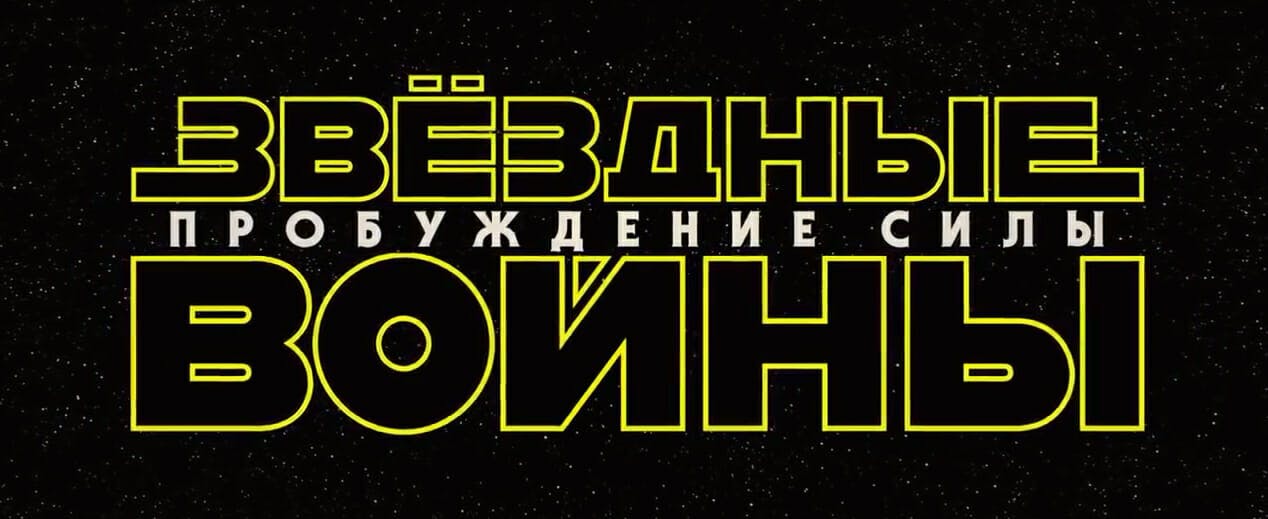
This isn’t the case in every country. Russia, China, South Korea, Israel, and Poland all have the Star Wars logo translated. In Russia, for instance, the film’s title looks vastly different based on the language’s Cyrillic alphabet. While the logos’ final designs vary from language to language, this leads to several interesting takes on Johnston’s revised logo, leaving many films with long top and short bottom lettering
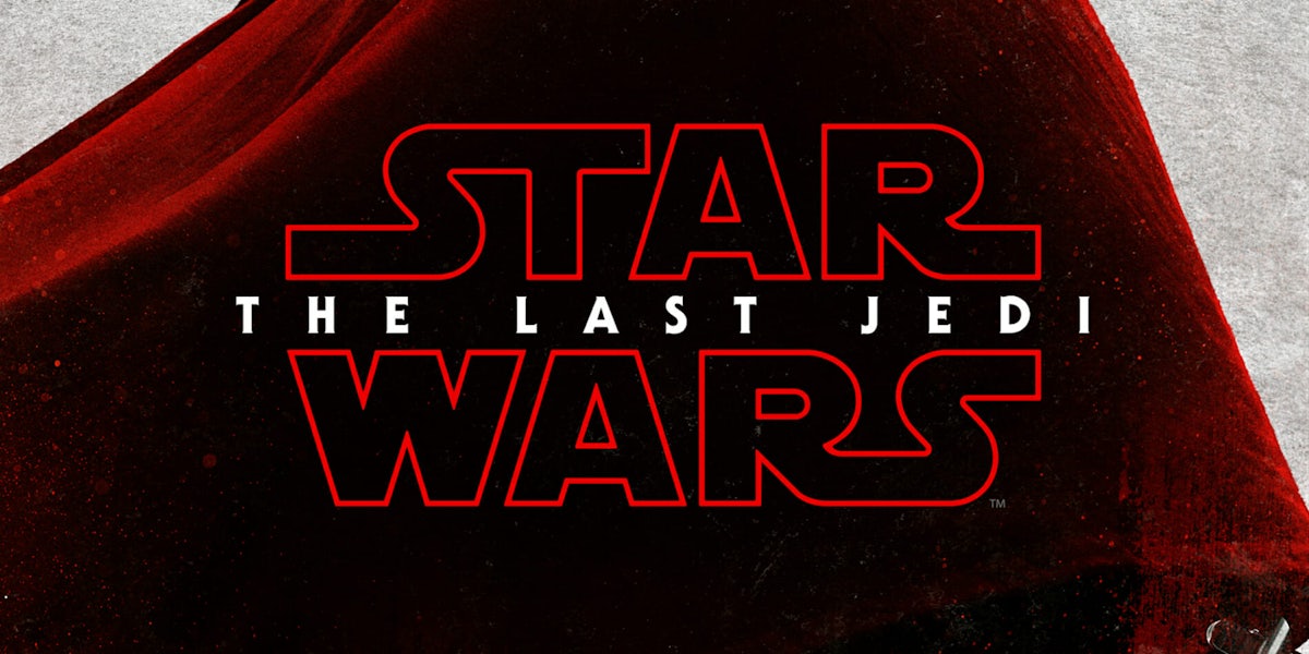
7. The red logo for The Last Jedi is purposefully ominous
Most Star Wars logos are yellow. The Last Jedi’s is red. When The Last Jedi’s trailer dropped, Star Wars fans around the world immediately noticed the difference. And yes, it’s on purpose. Wired points out that red traditionally symbolizes “danger” and death in Star Wars. (There’s a reason Darth Vader, Darth Maul, and Kylo Ren carrying red lightsabers.) Even outside the series, red commonly symbolizes aggression and blood-shedding in storytelling.

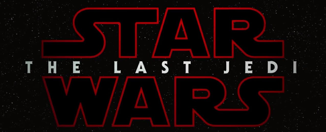
The logo’s color change is unsettling in its own right. Abandoning that classic yellow design suggests serious twists and turns in The Last Jedi. Star Wars fans picked up the message and walked into the film noticing that things would be different.
8. Star Wars tie-in products like to reference each others’ logos too

Have you picked up Star Wars: Squadrons yet? If you grew up playing Star Wars starfighter games in the 1990s and 2000s, you may want to check it out. It’s a great throwback to those classic Star Wars games. The game’s logo even wears its inspiration on its sleeve.
Back in 1997, Lucasarts released Star Wars: X-Wing vs. TIE Fighter, one of several games in its starfighter space sim series. The game uses the Star Wars logo on the top and a closed frame with its main title in enormous lettering right underneath.

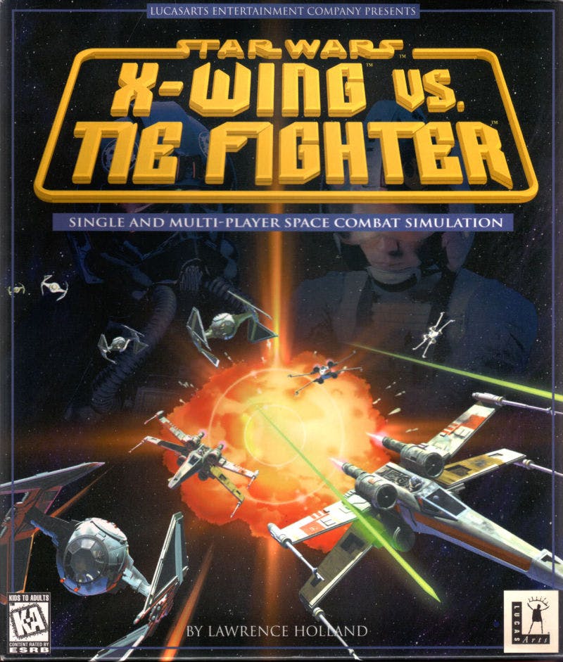
Star Wars: Squadrons utilizes a similar format referencing this exact approach: The game’s logo appears at the very top of the box art and places “Star Wars” in smaller text over the game’s main title. Both also use a frame, albeit Squadron has an open frame design to go along with its sleek, 2D look.
The similarities continue on the box art. Both covers juxtapose Rebel and Imperial pilots side-by-side amid starfighters in combat with one another. Squadrons uses a white background to contrast with X-Wing vs. TIE Fighter’s black, starry space.
It’s all a subtle nod to the past, but a nod nonetheless, and one appreciated by old school fans picking up EA’s game.