


We get it, Twitter. You see a lot of activity. Hundreds of millions of tweets per day, we’re told.
Those tweets have to come from somewhere, though, and many of them are geotagged with specific locations.
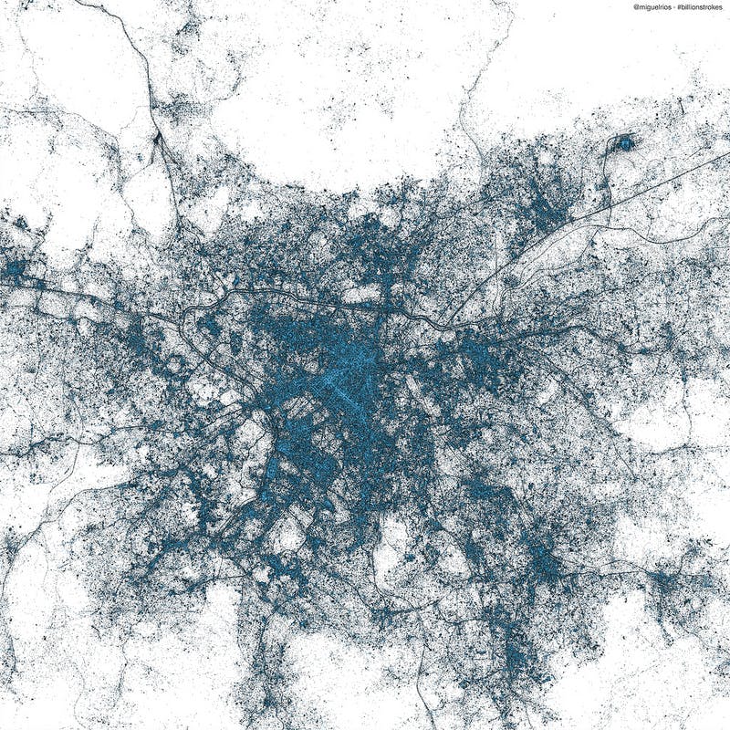
There are, of course, certain patterns one might derive from those geotagged tweets. Miguel Rios, Twitter’s visual insights manager, has put mapped out every one of the billions of geotagged tweets since 2009.
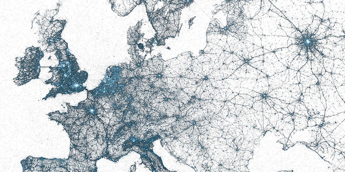
The images are stunning. Here’s Europe, for instance.
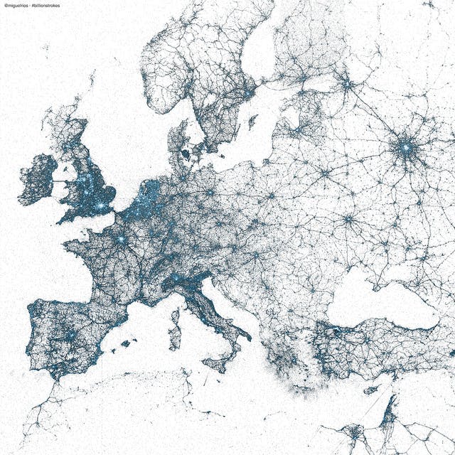

Each dot, Rios wrote, represents a tweet, and the color represents the number of tweets. (He did not elaborate on which colors represent more tweets, but it seems the brighter the hue, the more tweets were sent from that location.)
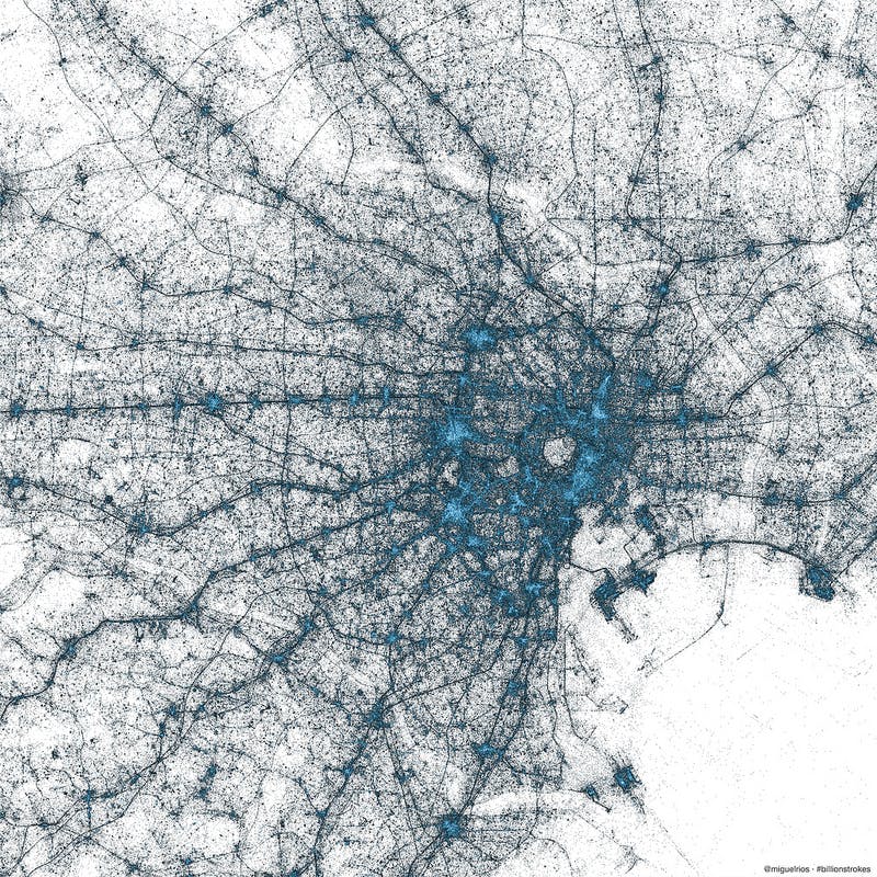
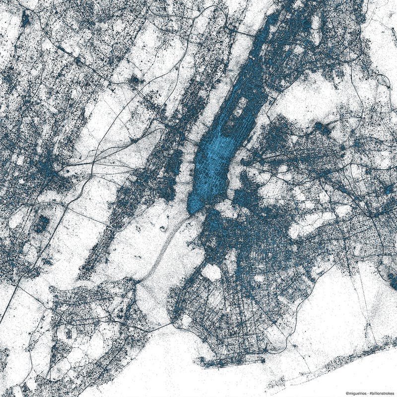
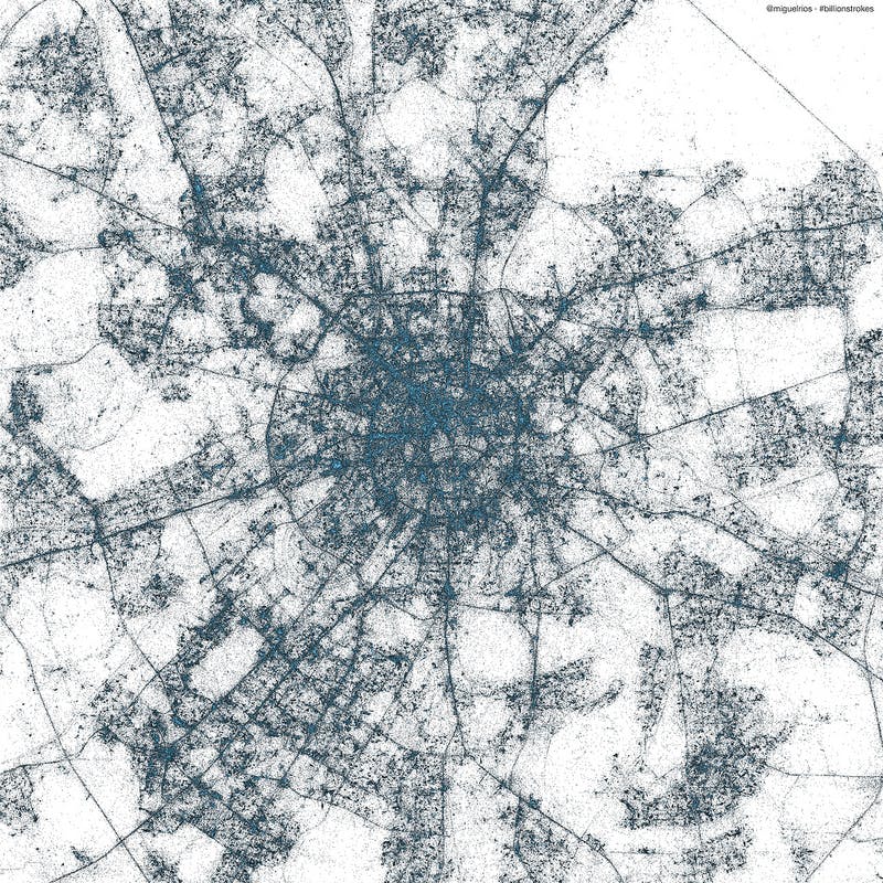
Rios put together a number of visualizations for particular cities. Here are a few of our favorites. You can check out high-resolution versions and other cities at Twitter’s Flickr page.
Tokyo

New York City
Sao Paulo
Moscow
Photos via Twitter Visualizations/Flickr