On Monday, June 9, 2025, Apple announced the brand new Liquid Glass design for iOS 26. People on social media have already started posting memes about the user-unfriendly design.
The announcement came at the WWDC 2025, where they held a 90-minute presentation about the latest software update. The new operating system will be available across all Apple products. According to Apple's press release, it is a "beautiful new software design."
"At Apple, we’ve always believed in the deep integration of hardware and software that makes interacting with technology intuitive, beautiful, and delightful," said Alan Dye, Apple’s vice president of Human Interface Design, in the company's press release.
Apple also jumped in operating system naming from iOS 18 to 26, to align with the fiscal year.
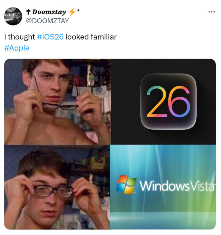
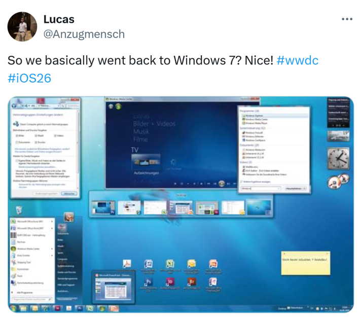
Folks on X were not impressed with the design shift away from Steve Jobs's minimalist ideal. The design creates a glass-like effect on buttons and widgets. While it creates spatial depth, some folks have noted the lack of accessibility. People are saying that the Liquid Glass design specifically makes it difficult to read the text on the screen.
Reactions to the iOS 26 redesign
Folks on X were quick to respond to the updated design announcement with a flurry of memes. Many of the memes centered around Steve Jobs. Specifically, how he would be rolling in his grave if he knew what was being done with his company.
On Threads, @durreadan01 shared an image of the new iOS 26 in action on an iPhone screen. They commented, "Steve Jobs must be rolling in his grave after seeing this sh*t. 😭"

The majority agreed that the new Liquid Glass design aesthetic goes against what Steve Jobs thought was important for design.
"Show me a worse downgrade than this is history of OS upgrades," @_mrchaturvedi tweeted with a side-by-side of his phone screen.
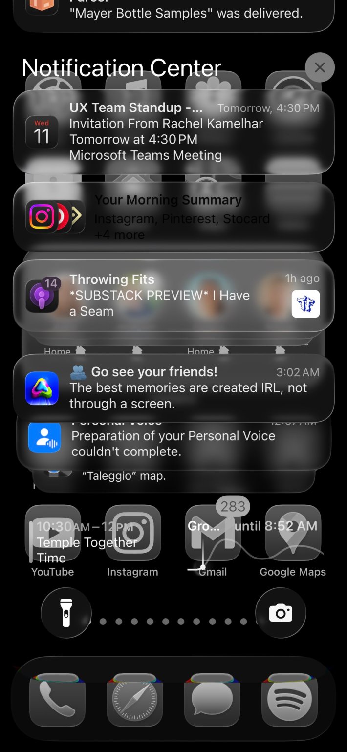
"every day we stray farther off steve’s light.. #ios26" tweeted @merterdir, with an image of a hard-to-read Notification Center screen.
Critics say the new design prioritizes aesthetics over accessibility
The biggest concern on people's minds was how people were going to be able to read the text on their screens.
"the new liquid glass looks abysmal and is a perfect example of focusing on form/ prettiness/ design over of functionality/ readability/ practicality. like, what are we doing here,” one person asked.
"Steve Jobs would have taken you out back and shot out your kneecaps for pitching something with this contrast ratio," wrote @aleksliving on X.
While many are criticizing the new operating system's design, there are others who say that it harkens back to the dramatic update to iOS 7 that eventually became the accepted norm.
"No update will ever beat iOS 6 to iOS 7," tweeted @jotmanjotman.
The internet is chaotic—but we’ll break it down for you in one daily email. Sign up for the Daily Dot’s web_crawlr newsletter here to get the best (and worst) of the internet straight into your inbox.