Dutch designer Christian Boer has created a forward-thinking new font targeted at those who suffer from dyslexia.
It’s called Dyslexie. Dyslexics—as many as one in 10 people—struggle with reading individual letters. For them, the Roman alphabet’s characters can be difficult to differentiate and letters often bleed together or are flipped upside down in their minds when processed. Boer’s t brings subtle, but key, qualities to each letter and this helps dyslexic readers more easily identify the proper letters.
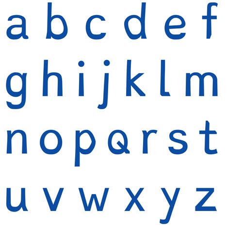
Photo via Dyslexie.com
Boer’s letters also leave fatter grooves with more distinct shapes and they serve as road blocks that keep dyslexic readers from assembling incorrect patterns. Moreover, his typeface builds in additional space between letters for, again, smoother reading.
This project was first designed in 2010, but is on display at the Istanbul Design Biennial through next month.
HT Dezeen Magazine | Photo via Wynnie/Flickr (CC BY 2.0)
