


Analysis
Marvel Cinematic Universe (MCU) fandom is a fount of strong opinions, some of which I find wholly understandable (Tilda Swinton’s role was a fiasco; Sebastian Stan is an underrated gem) while others are a little more… puzzling. In the latter category, it’s always bizarre to see people praise the MCU’s lighting. Unlike the artistic vigor of the comics, Disney’s Marvel franchise delivers film after film that can best be described as “murky.” And that includes the popular technique of just blasting a scene with a single color.
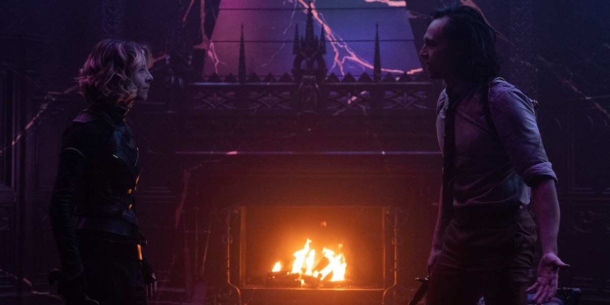
This week saw the release of Black Widow and the Loki finale, both involving a similarly lackluster lighting strategy. Black Widow‘s final sequence includes flashes of red to break up the grey undertones of a traditional Marvel battle, while Loki concludes in a purple castle—after fighting a purple CGI behemoth in episode 5. In both examples, the result is deceptively monotonous. While Loki‘s purple color scheme is initially eye-catching, the low-contrast lighting makes it hard to make out the characters’ facial expressions. The same goes for many other scenes in the show, as evidenced by this official promo image:

There’s nothing wrong with filming in monochrome, of course. The film industry did it for the first forty years of its existence. But Marvel’s “paint it all purple” (or brown, or red) technique ignores the shadows, reflections, and highlights utilized in traditional black-and-white films. So we’re neither benefiting from evocative lighting choices or from the vibrant color palette in blockbusters like Superman (1978). (For a classic superhero movie that probably would work in black and white, Tim Burton’s Batman is full of stark, noir-style contrasts.)
Like the Russo Brothers’ MCU films, Loki has flat lighting and a limited palette. Individual scenes are often drenched in a single color, but the overall tone is dark and murky. This makes it easier to edit the color scheme in post-production—and incorporate CG elements. To be clear, I’m not anti-CGI. Greenscreen effects are ubiquitous in modern cinema, but the quality depends on the director’s expertise and personal involvement in the process. A lot of blockbusters farm out their VFX work to underpaid contractors, resulting in a very different relationship (and artistic output) than in-person collaborations with production designers or set-dressers. Overseas contractors also pose a temptingly cheap option for studios, circumventing the need for unionized labor back home. The reliance on CGI is not just a creative choice.

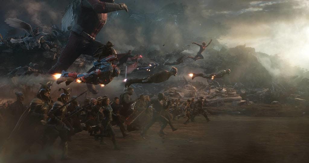
The final battle in Avengers: Endgame is beloved by many MCU fans, but to me, it’s the ultimate exemplar of the franchise’s horrible lighting. While the MCU includes some gorgeous fully-CG sequences (for instance the rainbow space scenes in Guardians of the Galaxy), problems emerge when filmmakers combine real actors with extensive CG action. Shot on greenscreen soundstages, the Endgame finale involves massive composite shots of characters fighting CG enemies while surrounded by nonexistent crowds. The final version is a muddy shade of grey-brown, with zero contrast between the characters. It takes place in a personality-free void.

The greatest trick Marvel ever pulled was convincing its fanbase that this is “good lighting.” The same goes for all the scenes tinted with one overpowering shade, an occasionally-effective technique that’s massively overused in recent MCU projects. And while Marvel Studios creators love to emphasize their comic book influences, they rarely seem to mean the comics’ visual style.
Marvel’s A-list characters emerge from the Silver Age era of bold, multicolored storytelling, and 21st-century Marvel comics utilize a wide range of artistic styles. Virtually none of this has been translated to the screen, with Disney even toning down the colors of iconic costumes to fit the franchise’s flat, grey style. Films like Black Panther and Thor: Ragnarok are rare departures from the norm, with director Taika Waititi taking direct cues from artist Jack Kirby for Ragnarok‘s vibrant palette. But this doesn’t seem to be a priority for Marvel’s higher-ups. If the formula remains profitable, then why bother trying to make things better?
More on Loki
| How Loki became a genderfluid icon in Marvel fandom |
| Marvel’s ‘Loki’ is an excellent showcase for Tom Hiddleston |
| What happened to Loki after ‘Avengers: Endgame?’ |
Sign up to receive our weekly streaming entertainment newsletter.