
Facebook famously launched from Mark Zuckerberg’s dingy, solitary dorm room and shortly thereafter what we’re led to believe was a ramshackle brogramming cave; now, the company’s vast Menlo Park campus is known for its sprawl and fancy amenities, with thousands of employees running the day-to-day and teams of expensive experts assembled to focus on each feature.
And as Facebook ballooned from college novelty to a tech titan, the core product evolved alongside its creative team, going from a one-man show to the kind of company that builds housing complexes for its well-appointed employees.
Looking at how Facebook’s website has evolved over the years, you can see parallels between the site’s looks and design and what was going on behind the scenes. This is how Facebook has changed over the last decade.
2004
Photo via Guest of a Guest
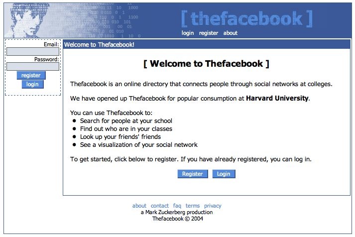
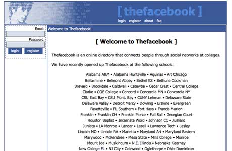
The original website is (vaguely) recognizable as the service we use today, but it is far clunkier-looking. There’s no gloss, and there are strange aesthetic choices that belie a young rogue creator (why the parentheses?). The signature blue color scheme has endured; the binary code and random, creepy man’s face at the top are long-gone. In terms of functionality, it’s hard to compare a single-school online directory to the communication behemoth Facebook has become.
The homepage makes it clear that this is Zuckerberg’s project: “A Mark Zuckerberg production” tags the bottom of each page. At first, Facebook was exclusive to Harvard, which was noted prominently on the site.
Harvard didn’t keep Facebook a Cambridge, Mass. exclusive for long. Later in 2004 it opened up to a few more schools. And then a few more. This continued throughout 2005.
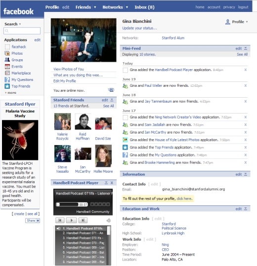
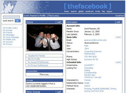
2005
Photo via Shareholic

Photo via Shareholic

This is what profiles looked like, before Timeline and Chat Heads and Cover Photos, back when you had to look someone up and click on their profile to see what they had posted.
Facebook was in directory mode. It wasn’t about communication as it was about acknowledgement (and apparently, we had “Away Messages” at one point, which is so quaint and AOL Instant Messenger-y I can hardly stand it).
Later in 2005, Facebook opened its doors to select high school students, but although it courted a younger set, the website didn’t go for a more juvenile look. Facebook kept its minimalist, blue-toned aesthetic, serving as a welcome contrast to the still-popular and bone-ugly Myspace.
2006
Photo via Devil’s Workshop
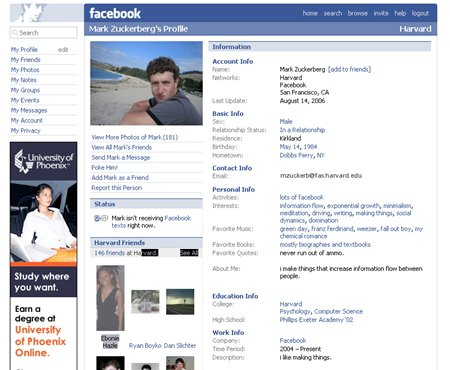
Facebook got a slew of new features this year. Status boxes popped up in 2006, though you had to click on someone’s profile to see them. The strange top-right-corner man still remained, his specter watching over us all. Facebook opened to all users over 13 with a valid email address, increasing its scope tremendously. One of the biggest changes in this period was the introduction of multiple photos. With this change, images took a far more central place in Facebook.
September 2006, a major development: Mini-Feed and News Feed debuted. These additions shook up the look of Facebook by shifting emphasis away from the profile and towards the actions people took on Facebook, moving the service from a directory to a feed. And people were not happy.
Another change that would have a major impact on the direction Facebook took down the road: The company added the “Share” button in late 2006, encouraging users to pass around links to third-party sites. This idea of Facebook as a news portal is something the service continues to cultivate.
All of these changes, of course, resulted in a much busier Facebook, a trend that would continue into 2007.
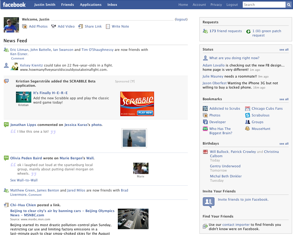
2007
Photo via Devil’s Workshop
Facebook continued adding gobs of features, from video to Facebook Pages to an app for iPhone. Notice the apps on the right side. It’s getting way too cluttered.
2008
Photo via AllFacebook.com
Hello, new-looking Facebook Wall.
This is one of the redesigns that made people go berserk and start angry groups saying they were going to quit if Facebook didn’t change the design back. Facebook didn’t change it, and they didn’t leave. This freak-out presaged the great Timeline freakout of 2011… but I’ll get to that shortly.
2009
Photo via Devil’s Workshop
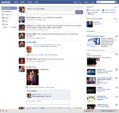
This layout, which tried to make the News Feed more like Twitter by updating it in chronological order in real-time, was even more loathed than the previous redesign; 1.7 million users protested against it.
I actually liked this version of Facebook the best, probably because I really like Twitter… and it looks the most like Twitter.
There were two redesigns in 2009, one in the spring and one in the fall. The one in the fall added back in some features that were removed during the redesign. One major change from the fall design: you didn’t need to refresh the page for updates anymore, which meant the News Feed was moving.
2010
Photo via Devil’s Workshop
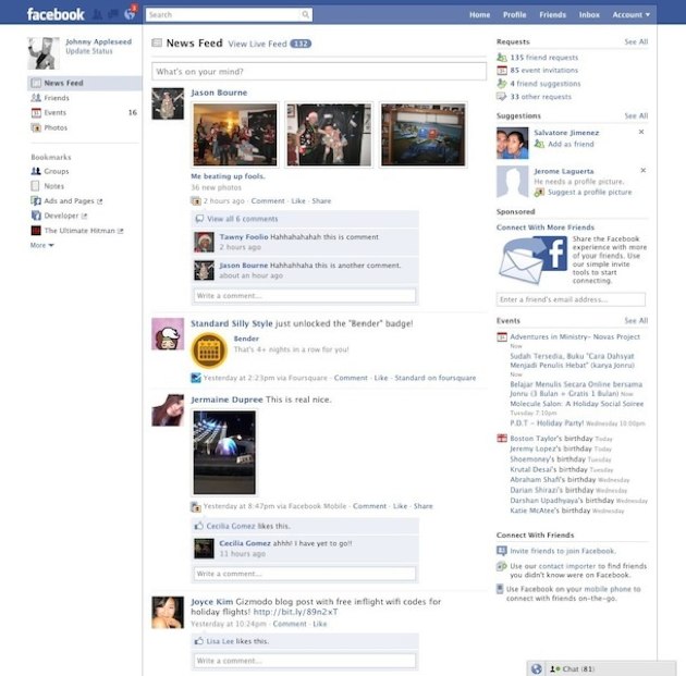
…still pretty similar to 2009. This is almost exactly what the homepage looked like after the second 2009 redesign.
After the two big redesigns, Facebook laid low on major changes for most of the year. Until December, when it gave its profiles a big makeover. Here’s a screenshot example from Facebook’s post describing the change:
Screenshot via Facebook
Facebook also made a video to walk users through the new profile:
2011
In late 2011, the odious Ticker appeared. It was and is an ugly design choice that unnecessarily crowds Facebook. Possibly the worst design choice the team has ever made.
A few weeks later, something even bigger popped up: the Timeline.
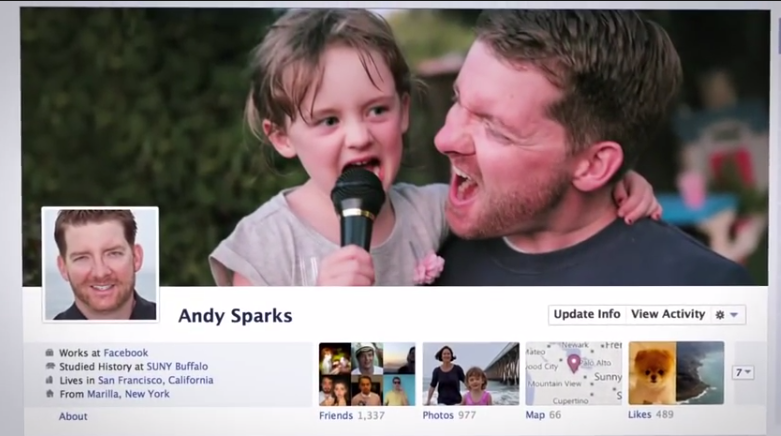
The Timeline was possibly the biggest aesthetic change Facebook as a whole underwent in one swoop, and it’s definitely the biggest adjustment to profiles. The Timeline’s two-column, image-heavy layout looked more modern, but also made it less fun to look at someone else’s profile, particularly what other people have written on the profiles of others.
It’s not a coincidence Facebook came out with the Timeline as it was gearing up to go public. The idea of the profile as a sort of digital scrapbook was easier to explain to investors than the Wall, and Timeline emphasized curating a collection of images and information about your life, while older versions of the profile were more about getting acknowledged by your friends.
2012
Facebook didn’t really redesign the News Feed or Profile in 2012. Probably because it was busy dealing with its IPO and buying Instagram. The company made Timeline for Pages, but personal Timeline and News Feed stayed pretty much the same.
2013
Screenshot via Facebook
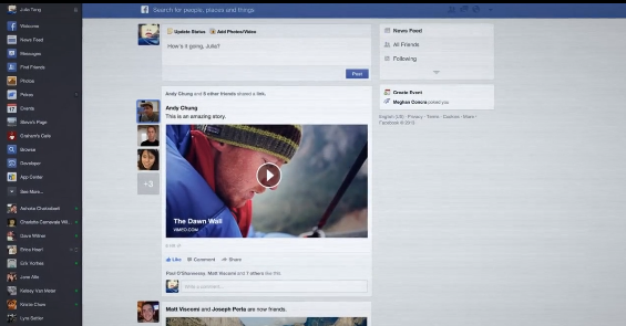
Facebook gave Timeline and the News Feed a major revamp in 2013, with much larger pictures and an aesthetic influenced by Instagram.
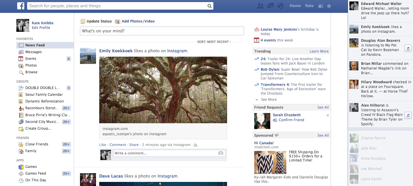
2014
You may be confused about why this version looks older than the one for 2013. This is my page, and I’m still waiting for the aforementioned promised version of things, so I am stuck in the past. Anyone else been on the waiting list?
As far as design goes, Facebook got off to a dubious start in 2014, introducing “Trending Stories” in a misguided attempt to rip off Twitter.
Even though the changes over the years have been roundly met with criticism, it’s hard to imagine anyone being too pleased with a return to the weird, amateur-hour 2004 design, though IMO the 2006-2011 stretch was Facebook’s finest on desktop. Paper—sleek, beautiful, new Paper—may become the company’s go-to mobile offering, and perhaps that aesthetic will filter onto the Web.
Really, all we want is for Facebook to get rid of that damn Ticker.
Illustration by Jason Reed