Craig Rozynski wants to make our lives better. For too long we’ve been mired in a world full of annoyingly quirky typefaces. Their bubbly, bold glyphs and ligatures mock us from the pages of advertisements, the blurbs of Internet memes, and the tomes of self-publishing. Their annoyingly wide kernings show up at the most inappropriate times. And no font is more egregious, more outlandish, more universally notorious, than the storied Comic Sans.
Now, Rozynski wants to change the world by removing the stigma—and that uneven squiggly look—from Comic Sans. Behold: Comic Neue.
Rozynski, an Australian digital designer living in Japan, set out to “fix the weirdness” of Comic Sans by injecting it with a less, well, comic flavor he told Creative Review earlier today. As the Daily Dot’s resident font expert Walter Coots puts it, “The new version has better continuity throughout the whole thing. The weight distribution is more even, the strokes are less wobbly, and the quirks (such as the crossbar on the uppercase A jutting out) are more pronounced and intentional looking.”
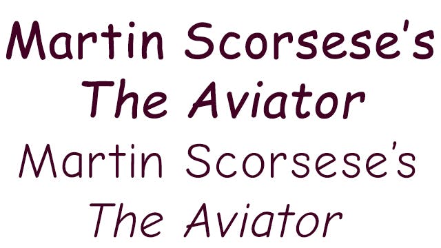
As you can see from the before/after above, the new typeface looks strikingly sophisticated next to the old one. But while Comic Neue undoubtedly gives a sophisticated touch to many of Comic Sans’ quirks, it also seems to have done away with most of them altogether. No longer does the lowercase ‘t’ resemble an upright umbrella with the top missing. No longer does the letter ‘s’ look quite so much like a friendly snake.
In fact, this new font barely even looks like something I’d expect to find in a Golden Book. What gives?
“The squashed, wonky, and weird glyphs of Comic Sans have been beaten into shape while maintaining the honesty that made Comic Sans so popular,” Rozynski wrote on his website.
That’s true. But we can’t help thinking that stripping Comic Sans of its curliecues and squiggly parts isn’t very, well, comic. To paraphrase Jane Austen, it’s much more rational, but it’s rather less like Comic Sans. And after all, isn’t Comic Sans’ abrasiveness part of what makes it fun? As McSweeney’s put it, “When people need to kick back, have fun, and party, [Comic Sans] will be there.” Comic Neue, you clean up nice, but when we want to get drunk and run through the sprinklers on our neighbor’s lawn at 2am, we won’t be thinking of you when we print out party flyers.
There is one thing we all enjoy, however, and that’s more fonts to choose from. For those among you who are less fussy about the way that fonts reflect on your life choices or your aesthetic sensibilities—and let’s face it, anyone who is has probably spent the 21st century using nothing but Helvetica—Comic Neue is temporarily free to download. Enjoy.
If you’re like me, and you just aren’t that invested in the cultural backlash against Comic Sans, Comic Neue is still a nice, clean font with personality.
(But then again, what do I know? I wrote this article in Arial.)
Photo by Aja Romano via Craigrozynski.com/