Two doctors have created an interactive map highlighting areas of Chicago with soaring prison costs in the hundreds of millions of dollars, in the latest disturbing revelation about the troubling state of America’s criminal-justice system.
“Chicago’s Million Dollar Blocks” shows parts of the city where the state government has paid hundreds of millions of dollars over a five-year period.
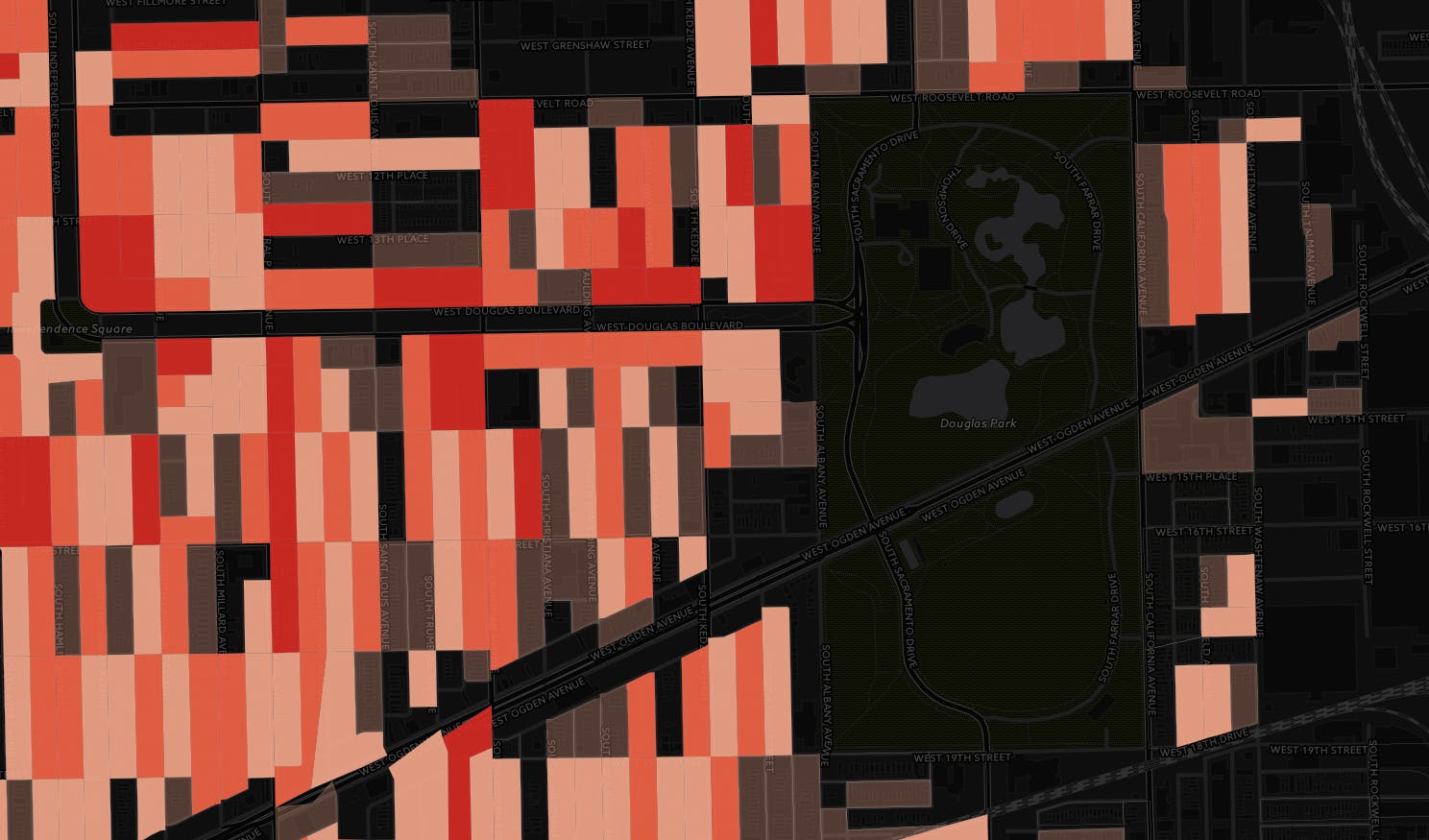
Chicago’s Million Dollar Blocks
In 2015, Illinois shelled out $1.4 billion to the Department of Corrections. In light of the state’s current fiscal crisis—it has approximately $8 billion in unpaid bills—the map’s producers found the state’s spending on incarceration not only ineffective, but also expensive in financial and human terms.
The map, produced by Dr. Daniel Cooper and Dr. Ryan Lugalia-Hollon alongside DataMade, uses Cook County Circuit Court data obtained by the Chicago Justice Project and represents all adult convictions between the years of 2005-2009.
Based on data like the offense itself, the length of the sentence, and the offender’s residential address, the map shows disparities between areas where spending for prison sentences is the most and least concentrated. Visitors can choose to view solely drug-related crimes or all crimes.
Unsurprisingly, the map shows that harsh sentences for offenses are doled out with overwhelming frequency to Chicagoans who live in segregated, low-income neighborhoods on the city’s west and south sides.
“This amounts to a war on neighborhoods,” the site reads.
“We derive dollar amounts from sentence lengths,” the map’s creators write of their methodology. “Our cost assumption is that, on average, the Illinois Department of Corrections spends approximately $22,000 per year for each inmate. Life sentences are calculated based on average life expectancy.”
“Our cost calculation is conservative,” they continue. “We assume that all those convicted will only serve their minimum sentence; the actual length of time served could be longer. For people with multiple offenses, we only used the sentence from the most severe offense — while this excludes some sentences from our calculations, it means that our drug incarceration figures represent strictly nonviolent offenders. We also exclude court and policing costs, which are substantial.”
The project takes its inspiration from the Million Dollar Blocks project by Laura Kurgan at the Spatial Information Design Lab, produced in collaboration with the Justice Mapping Center. In line with recent trends pushing for transparency, the project’s code is open-source and readily available on github.
Though the map’s creators decry the city’s “wasteful spending”—citing research showing that incarceration does not necessarily reduce crime—its authors also suggest alternative approaches that are in use elsewhere in the country.
These methods, including Workforce Development, Addiction Treatment and Mental Health Diversions, have the potential “to expand the menu of options for public safety,” they wrote.
Photo via Arvell Dorsey Jr./Flickr (CC BY 2.0)