BY JOE PACAL
I love what just happened on the Internet!
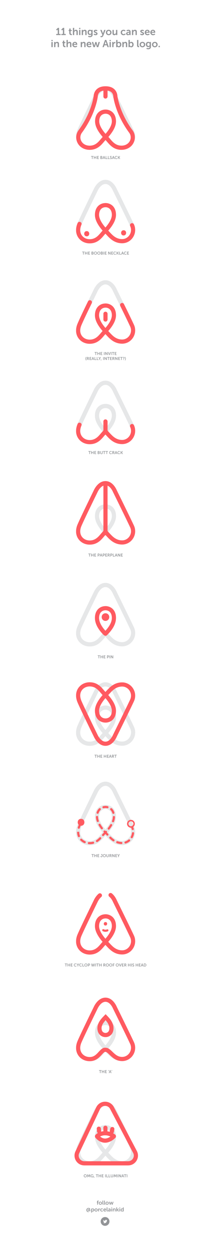
The new Airbnb logo sparked an incredibly ridiculous discussion about a topic not-so-often covered — branding. People just love mocking things for the sake of doing so to belong to a tribe, but what should be the actual takeaway?
It is a fun release of a new brand and this doesn’t happen all that often.
It doesn’t matter if you think the logo is dirty or not, all the publicity is good for Airbnb and we all got trolled. Logo is as good as its explication, and the official one is a damn strong one.
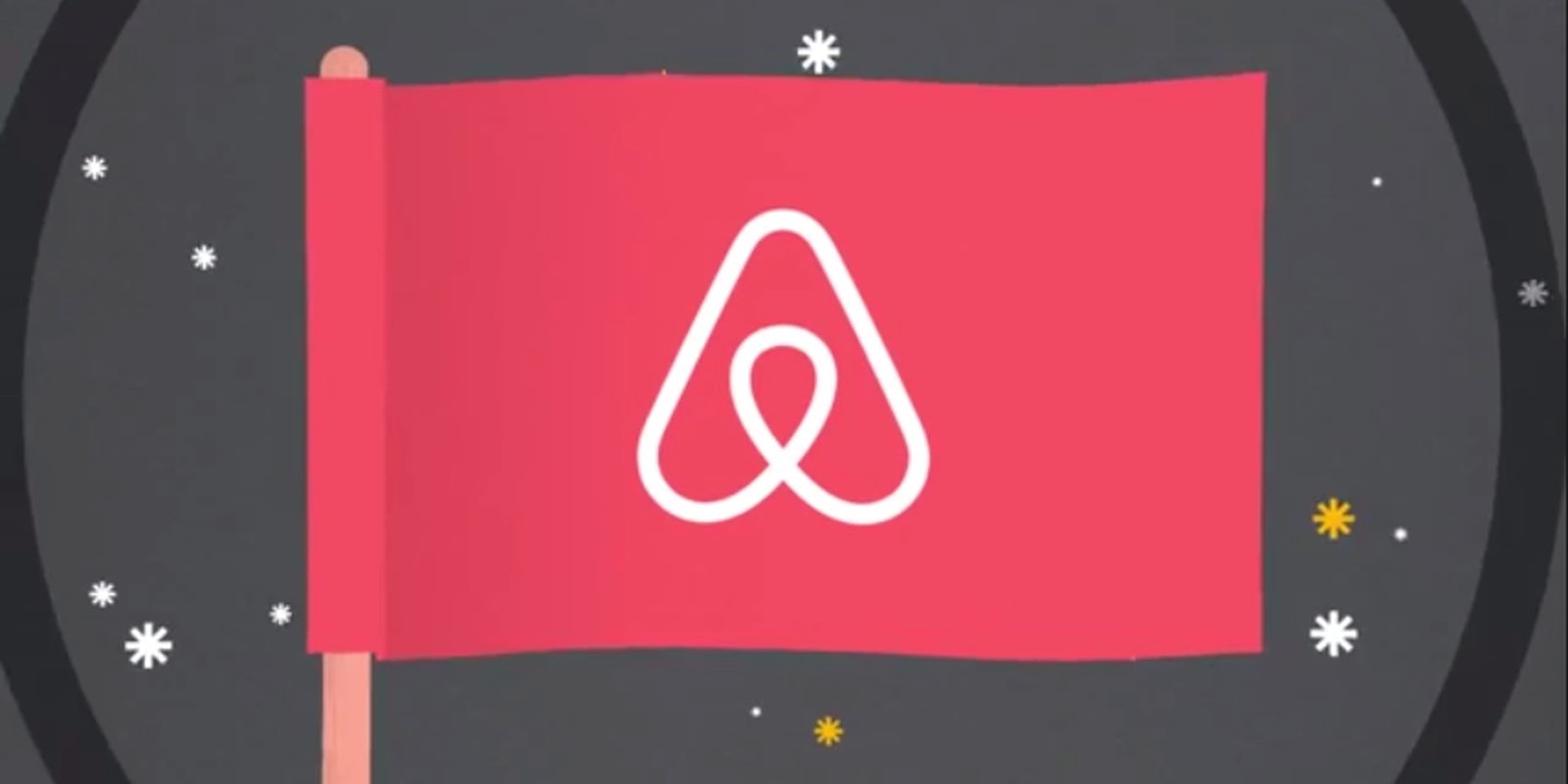
The graphic is insanely simple and instantly memorable. It has the Nike/Adidas quality of burning into your retina (screen).
Airbnb’s mission is to connect people and experiences through places, and the logo says it all. DesignStudio did an amazing job portraying Airbnb’s values, as you can see in the brand video below.
;
It is all about “belonging,” being part of something bigger than ourselves. For Airbnb, bigger is belonging to a community — and as of today, this community is hosts & travellers of the world.
If you need proof, look around. The Internet just played its cards by ‘belonging’ to a tribe, caring enough to enjoy a discussion about the brand.
They went for owning a feeling and not talking about themselves.
This may seem counterintuitive, but since both concepts share one symbol (mind you, simple enough to be drawn by a child), Airbnb becomes synonymous with the warm feeling of belonging. Philosophically, this elevates Airbnb from a bed–n–breakfast search engine to where Couchsurfing stands, but without the vagabond stigma attached.

Brand roll-outs are boring. They suck. Typically they are fueled with baseless hate and negative comments from the internet. In a typical scenario you would read about the rebranding on one or two blogs and tomorrow it becomes old news (unless you’re a designer, then you’d bediscussing the kerning between letters for weeks to follow).
Not only did Airbnb succeed, they rolled-out a great logo and an amazing set of applications for it. But more importantly, the slight faux pas got everyone talking about them and hence they’ve effortlessly explained what the logo stands for. It got people together.
In the end what will we remember? The new logo, the fun we had when it was introduced, and what it truly stands for.
As far as I can remember, the last time people talked so much about a logo is when Gap decided to change theirs to look like a piece of shit.
Joe Pacal is a brand designer and cofounder of @Pitchme. You can follow him on Twitter @porcelainkid.
This article originally appeared on Medium. Republished with permission.
Screengrab via YouTube