BY MEGHAN NEAL
Wi-Fi. It’s all around us, quietly and invisibly powering our access to the world’s information. But few of us have a sense of what Wi-Fi actually is, let alone what it would look like if we could see it.
Artist Nickolay Lamm, a blogger for MyDeals.com, decided to shed some light on the subject. He created visualizations that imagine the size, shape, and color of Wi-Fi signals were they visible to the human eye.
“I feel that by showing what wi-fi would look like if we could see it, we’d appreciate the technology that we use everyday,” Lamm told me in an email. “A lot of us use technology without appreciating the complexity behind making it work.”
To estimate what this would look like, Lamm worked with M. Browning Vogel, Ph. D., an astrobiologist and former employee at NASA Ames. Dr. Vogel described the science behind wireless technology, and Lamm used the information to create the visualizations.
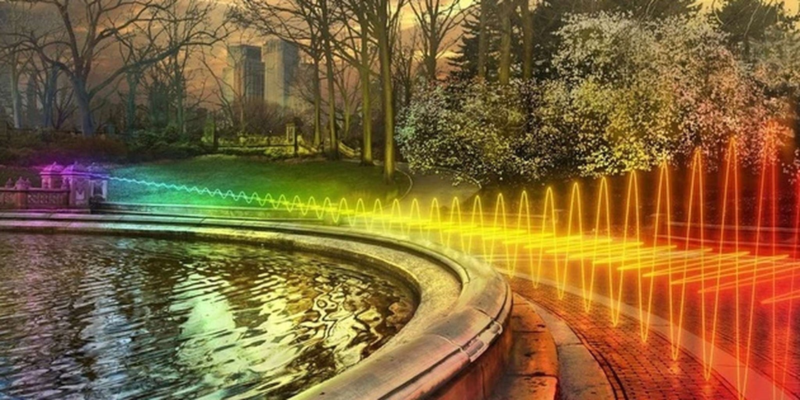
Dr. Vogel provided captions for each illustration explaining the science of wi-fi. The caption for the illustration at the top of the article describes the size of a Wi-Fi energy field, and how a signal is transmitted. It says:
Wifi is an energy field that is transmitted as waves. The waves have a certain height, distance between them and travel at a certain speed. The distance between wifi waves is shorter than that of radio waves and longer than that of microwaves, giving wifi a unique transmission band that can’t be interrupted by other signals. Wifi waves are about 3 to 5 inches from crest to crest. The crests of waves is translated to a 1 by a computer, and the the troughs equal a 0. Chains of 1s and 0s that can be translated into the letters, numbers and codes that make up websites, email and other internet content. Typical wifi waves decrease in amplitude as they travel further from the source which is why the waves are larger to the right and smaller to the left, assuming the source is somewhere near the right of the image. This image shows an idealized wifi data transmitted over a band that is divided into different sub-channels, which are shown in red, yellow, green and other colors.
The Wi-Fi visualizations are set in Washington, DC. Lamm used data from a map on DC.gov to approximate the size and shapes of Wi-Fi networks over the National Mall.
Below are Lamm’s images, with Dr. Vogel’s captions underneath.

Read the full story on Motherboard.
Photos via Nickolay Lamm