Just a few weeks after Google announced it would form a new parent company called Alphabet, the brand we knew so well is getting a makeover.
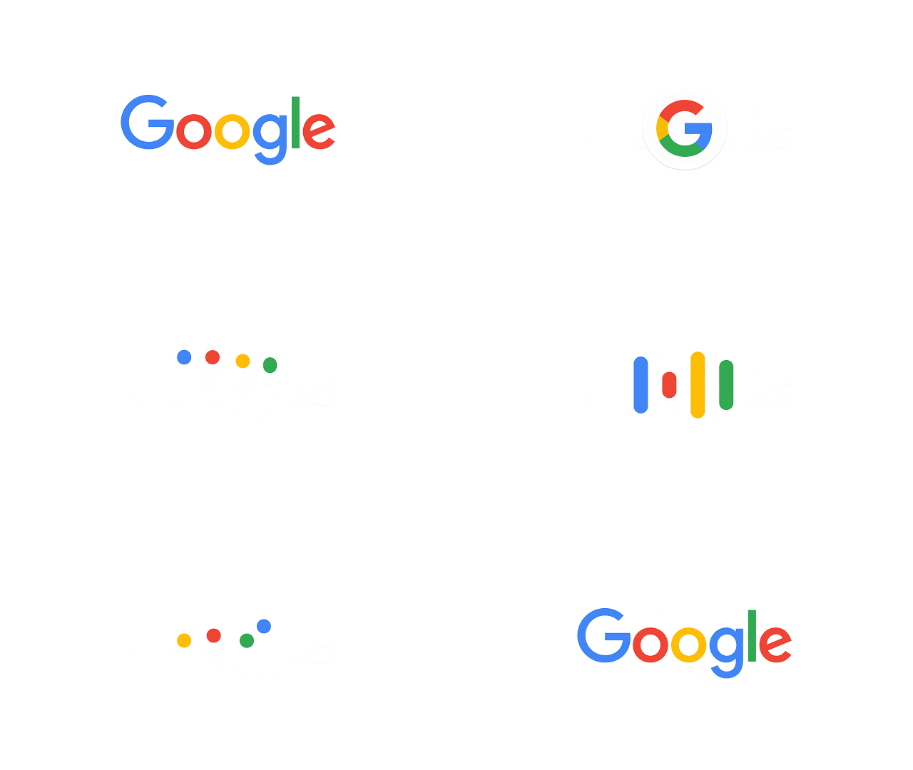
Tuesday, Google unveiled a new logo and icons, meant to better reflect Google’s products and services across both desktop and mobile. In a blog post, the company explained how the original logo and branding were created for a desktop browser page, but didn’t fully represent Google’s mobile ecosystem and suite of products. But the new logo brings animation and modernity to the company.
It doesn’t simply tell you that you’re using Google, but also shows you how Google is working for you. For example, new elements like a colorful Google mic help you identify and interact with Google whether you’re talking, tapping or typing. Meanwhile, we’re bidding adieu to the little blue “g” icon and replacing it with a four-color “G” that matches the logo.
The logo eliminates the serif font in favor of a rounder, more modern, and colorful representation of Google. The company says it’s a “great reflection of all the ways Google works for you across Search, Maps, Gmail, Chrome and many others,” while keeping a “friendly” look.
Photo via Google / YouTube (CC BY 2.0) | Remix by Max Fleishman

