Baseball, probably more than any other sport, is dissected, analyzed, and broken down through a dizzying array of statistics and other measurables.
Perhaps the slow pace, combined with the quantity of games during a Major League Baseball season, leaves people with too much time to think about it. But while teams are measured in simple wins and losses, individual players are judged on an ever-increasing list of statistical categories, such as batting average, home runs, RBIs, ERA, WHIP, RAR, BABIP, LIPS, and many more.
This penchant for baseball geekdom has taken on new life on the Internet, where interactive charts and infographics travel more rapidly than a Nolan Ryan fastball (or Aroldis Chapman, for you youngsters).
Though it’s opening day, the Internet is in midseason form when it comes to sharing fun baseball information. In fact, the scope of the baseball intel in circulation has expanded far beyond the game itself. To show you what we mean, here are five fascinating charts to help tell the story of the 2014 MLB season that made the rounds on Monday.
1) Yankee fans are everywhere
Using data drawn from Facebook, the Wall Street Journal mapped the counties of the United States by MLB teams’ fans. The New York Yankees, as designated in black on the map below, have fans across the country, while their crosstown rivals the Mets, as well as the Oakland Athletics and the Toronto Blue Jays, do not control the plurality of fans in any U.S. counties.
The United States of Baseball: A geographical breakdown of MLB fans courtesy of @Facebook. https://t.co/Ti4QBkGi0p pic.twitter.com/fBhzHwnMne
— WSJ Sports (@WSJSports) March 31, 2014
2) Pop the question in Pittsburgh
If you want to propose to your sweetie in front of thousands of strangers, the most economical location to do so is at PNC Park in Pittsburgh, where a video-screen proposal goes for $39. At Dodger Stadium in L.A., the same public display of affection will set you back $2,500, according to a graphic published by Swimmingly, a relationship advice site.
Here’s How Much It Costs to Propose at Every Major League Baseball Stadium https://t.co/JLDRm0maw5 pic.twitter.com/FThxCnn9n7
— Swimmingly (@_Swimmingly) March 31, 2014
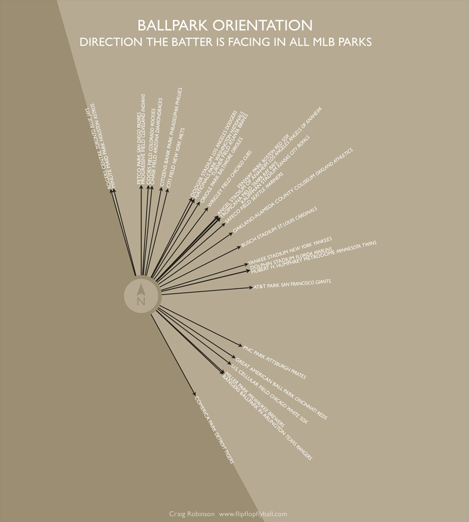
3) No MLB stadiums face west
Fielders, rather than batters, are tasked with staring into the setting sun, as MLB stadiums are almost universally oriented somewhere from North to Southeast. Reddit user mrfisk14 posted the following stadium orientation chart on Monday. Upon further investigation, Craig Robinson of Flip Flop Fly Ball created the graphic in 2009. It’s one of many interesting infographics and baseball art projects found on Robinson’s site.
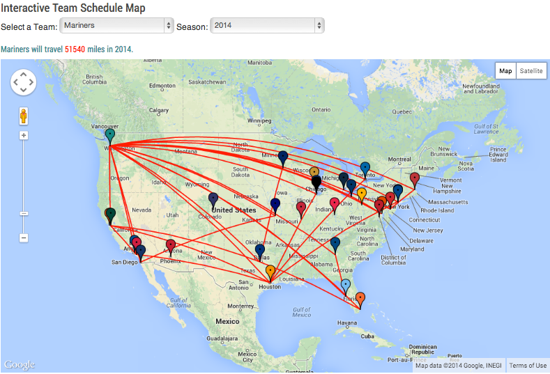
4) The Mariners will lead the league in at least one stat in 2014
That stat is distance traveled. The Seattle squad’s 2014 schedule calls for more than 51,000 miles of travel, according to an interactive map created by Daren Willman of Baseball Savant. Below is an image of the Mariners’ rigorous travel schedule. Visit Baseball Savant to see how much distance other MLB teams will travel in 2014.
5) Dodgers are literally hurting for cash
The L.A. Dodgers start the 2014 with nearly $58 million wrapped up in players who are injured and on the disabled list, according to the sports research site Spotrac. That’s more money than the entire payroll for both the Miami Marlins ($44 million) and the Houston Astros ($50 million). An image showing the top 10 MLB teams by payroll is below. Check out Spotrac’s interactive graphic on team salaries for more on the topic.
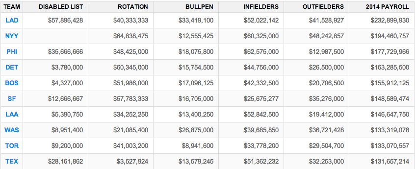
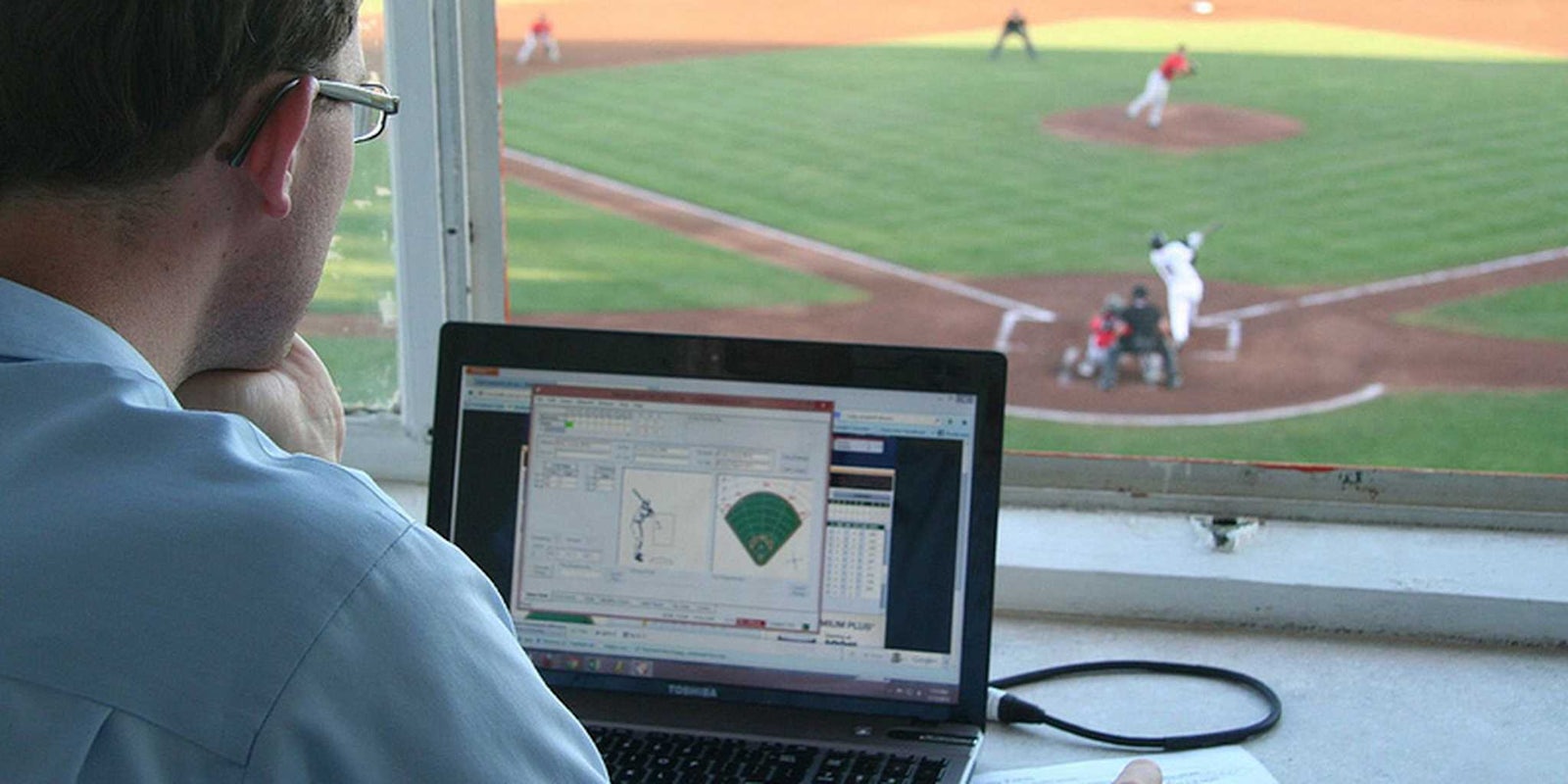
Photo by Intel Free Press/Flickr (CC BY-SA 2.0)