Between waves of protests, a Department of Justice investigation, and damning report after damning report, the U.S. shouldn’t need more convincing that police brutality against black people is a real and pressing problem. But quantifying that violence has proven surprisingly difficult, frustrating activists and confusing policymakers.
As FiveThirtyEight writer Reuben Fischer-Baum has repeatedly noted, keeping track of police homicides is an effort “beset by systemic problems,” in part because there is no government initiative to track “unjustifiable” killings by police officers. Crowdsourced databases have stepped in where federal, state, and local governments have failed, but even the best existing resources include limited information about the racial makeup of victims, which is key to understanding how to prevent fatalities grounded in racial bias.
In an effort to fill in the blanks, data scientist Samuel Sinyangwe and other activists used social media and online obituaries to code by race the homicides included in existing crowdsourced databases such as FatalEncounters.org, the U.S. Police Shootings Database, and KilledbyPolice.net, eventually covering 88 percent of reported incidents.
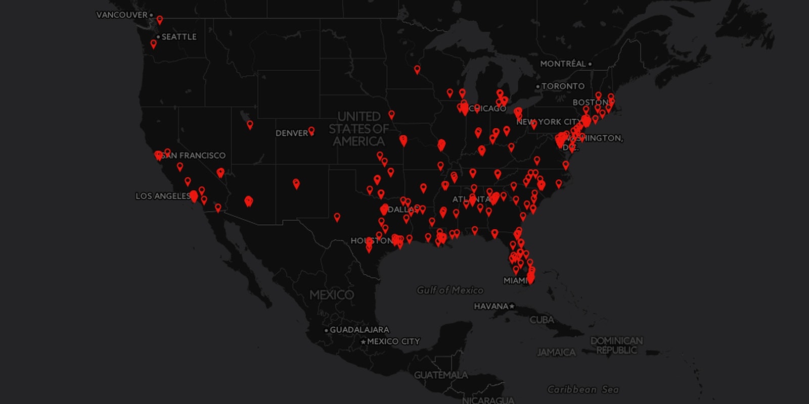
The result is Mapping Police Violence, a website that visualizes where and when police homicides occurred in 2014 through maps and graphs.
Mapping Police Violence uses hard data to support what many people living in areas scarred by rampant police brutality have long understood through experience: that Americans are more likely to die at the hands of the police if they are black and that this risk is not a byproduct of living in high-crime areas. Demographically similar cities can have radically different rates of police brutality against black residents, suggesting the culture and practices of the police department play an important role in protecting black lives.
Visitors to the site can compare jurisdictions to gauge which cities with substantial black populations have the biggest problems with police homicides. There are also graphs depicting how the number of police-perpetrated homicides is changing over time, and a map of the U.S. that illustrates hot spots of police violence.
In the future, the creators of Mapping Police Violence want to make it easier for people to understand the variation between communities by designing an interface where visitors can enter their age, gender, race and ZIP code to understand how such factors affect the chance of being killed by the police. Ultimately, according to Sinyangwe, the site will expand to become a kind of dashboard for activists to better understand existing policies in their community, as well as policies that have successfully reduced police violence in other areas.
Asked if he thought building a more robust data set could push governments toward better record-keeping, Sinyangwe acknowledged the possibility of working with lawmakers but said the urgent nature of the project calls for more immediate action.
“People are dying every day,” he told the Daily Dot. “So we need to act and build our own institutions rather than waiting on Congress to do that work.”
Screenshot via MappingPoliceViolence.org