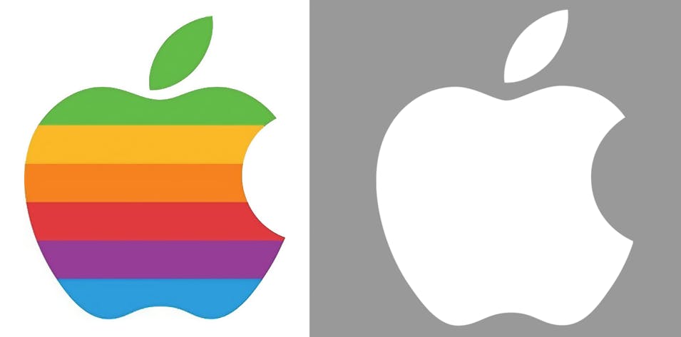
It’s hard to imagine a world in which the iconic Apple logo isn’t emblazoned upon smartphones and laptops everywhere you look, but back in 1976, things were very different.
For virtually its entire existence, Apple’s logo has been a simple apple shape with a leaf and a missing piece. It’s straightforward and impossible to confuse with anything else, and that’s why it’s stuck around for so long.
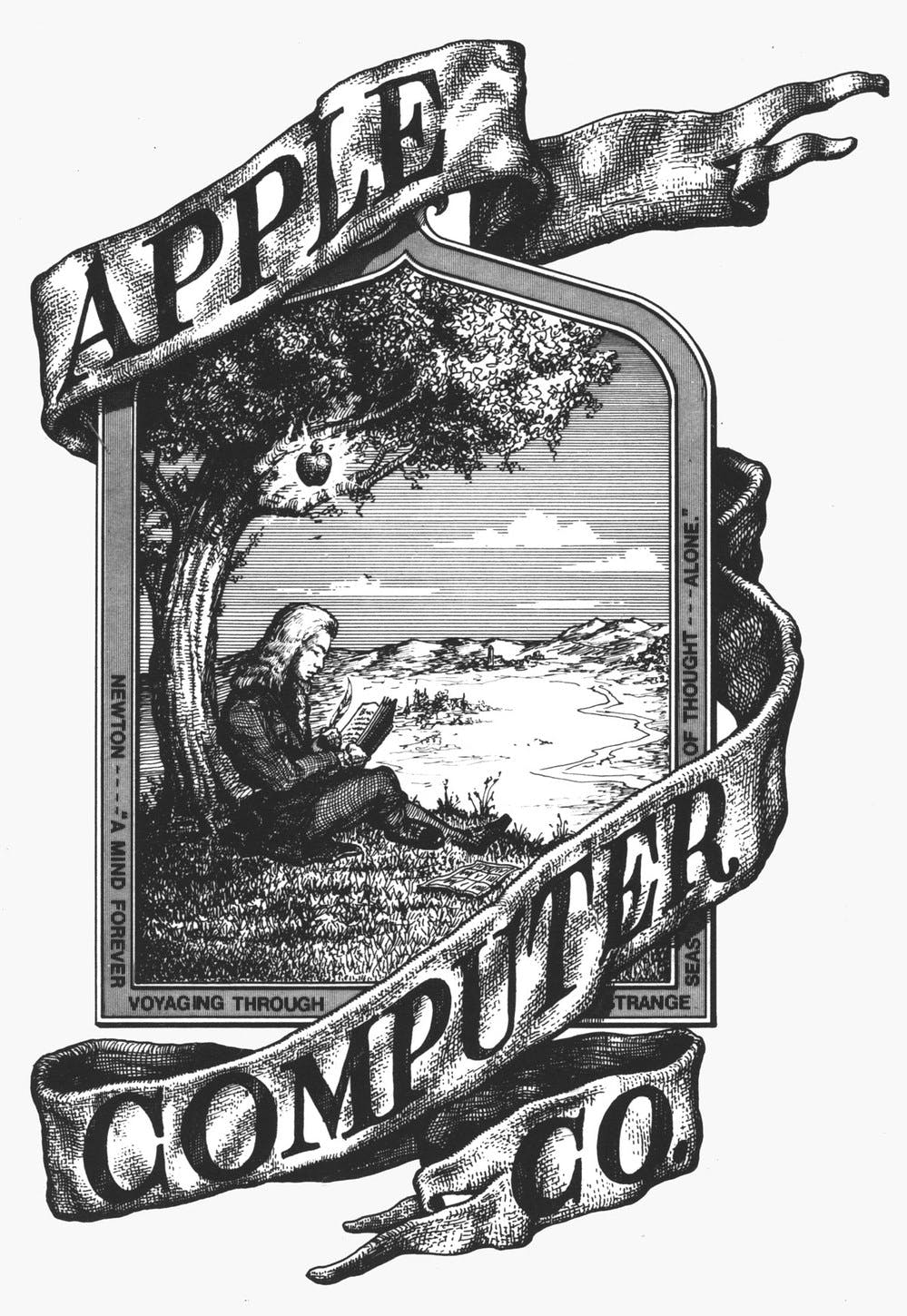
But when Apple debuted in the mid-1970s, oft-forgotten Apple co-founder Ronald Wayne actually drew the first logo for the company.
Apple
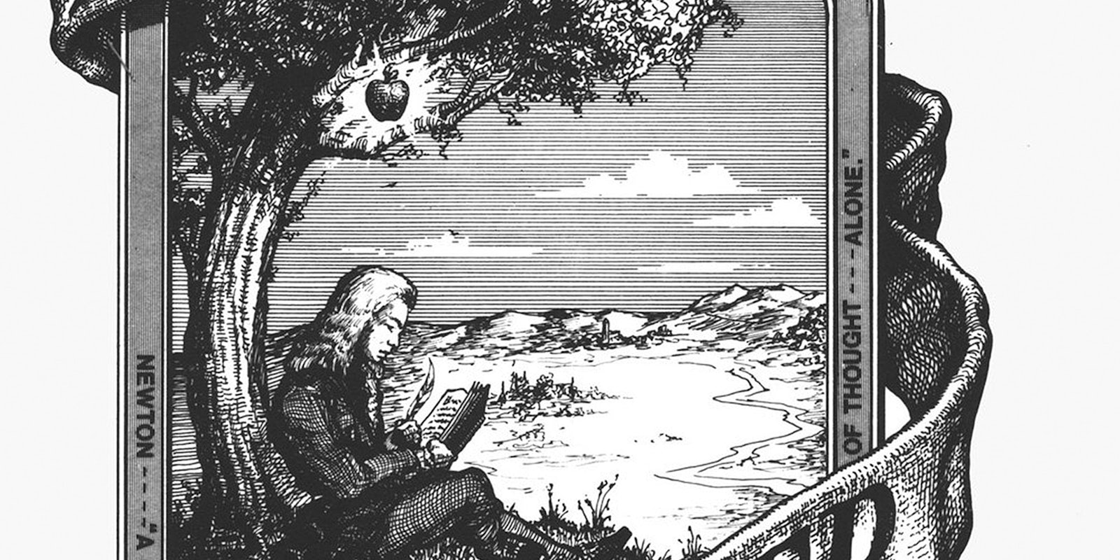
It’s an intricate rendering of Sir Isaac Newton, leaning against an Apple tree, with a wrinkled banner labeled Apple Computer Co. A quote borders the scene: “A mind forever voyaging through strange seas of thought … alone,” by poet William Wordsworth.
As far as company logos are concerned, it’s extremely ornate and complicated—the absolute opposite of what would eventually become Apple’s iconic branding.
Apple
Apple only used the Newton logo for about a year before Steve Jobs, it’s reported, axed it in favor of the Apple “rainbow” logo, which eventually evolved into the modern design.